-
01
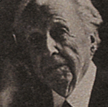
Frank Lloyd Wright poster
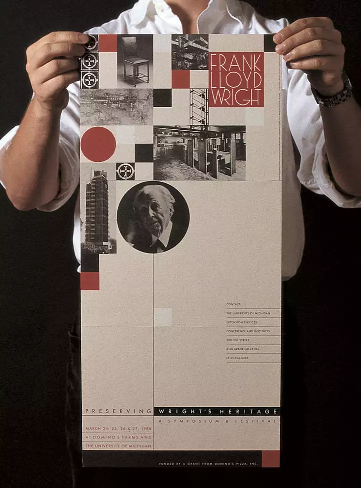
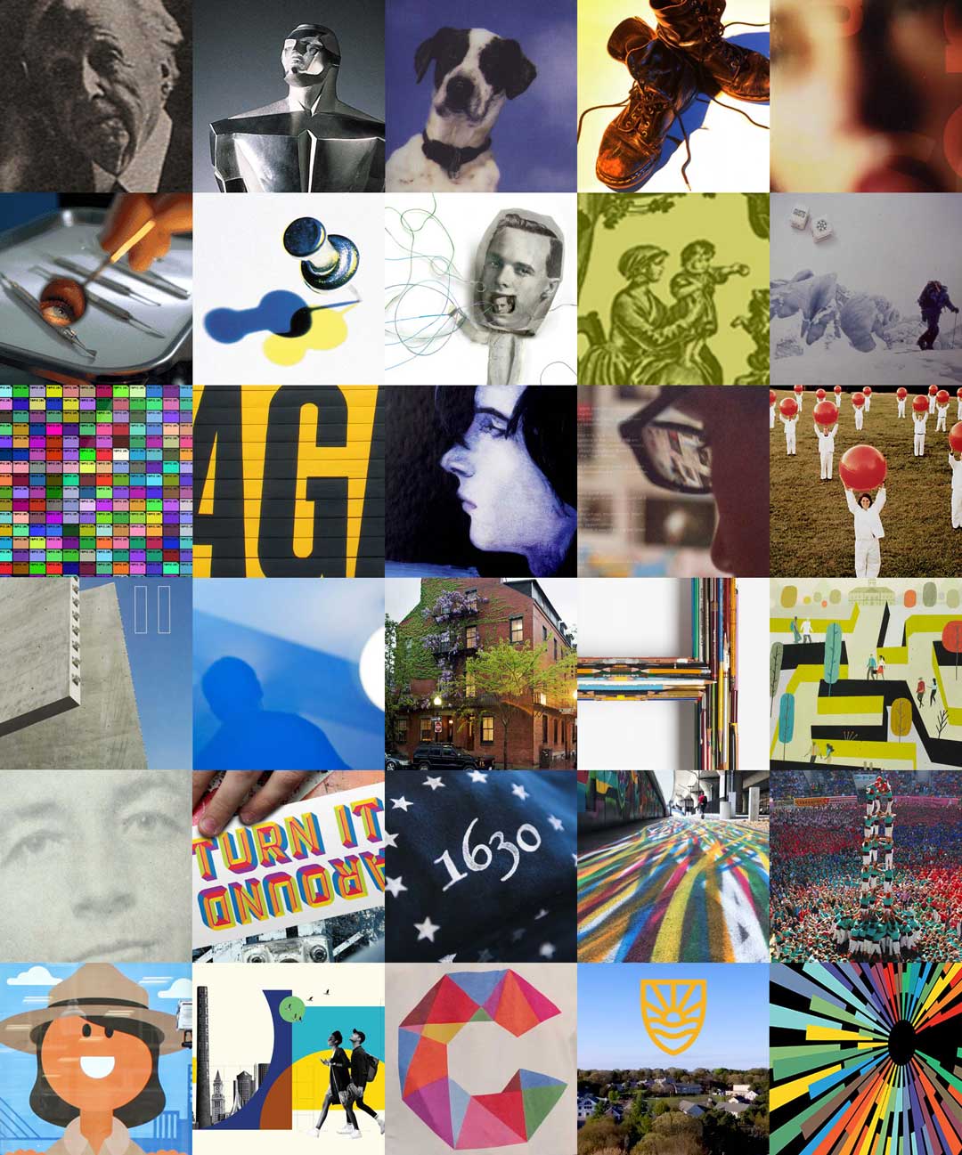
Drum roll… THE first official Visual Dialogue project while still a student at University of Michigan. The Frank Lloyd Wright symposium was sponsored by Domino’s Pizza (whose founder was something of a FLW fanboy).
-
02
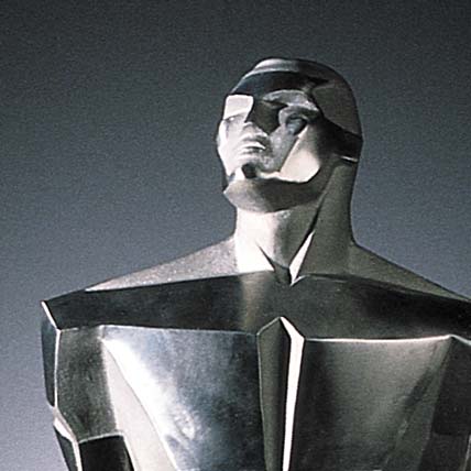
Coaches Choice Trophy
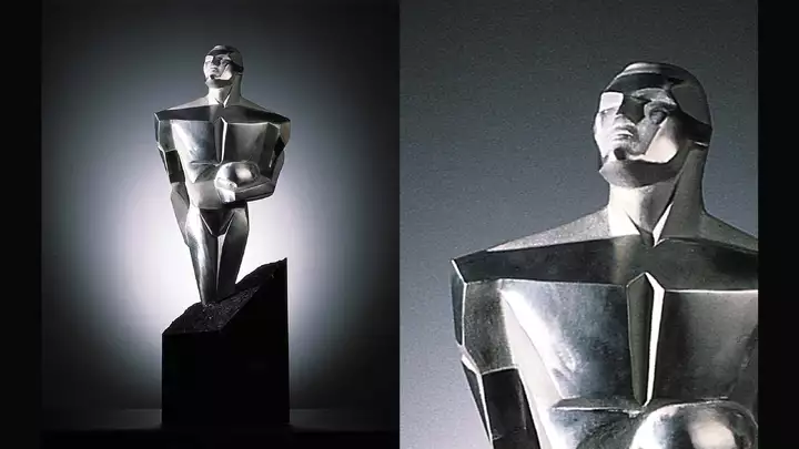
Visual Dialogue’s move from Ann Arbor to Boston (with co-founder Paul Montie) was funded by this college football player of the year award sponsored by Domino’s Pizza. In addition to putting sculpture skills to use, this design was also an intro to trademark law—thanks to Domino’s lawyers.
-
03
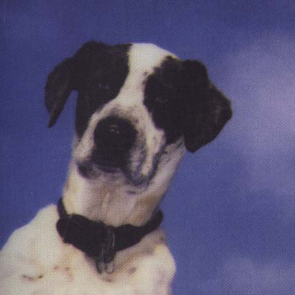
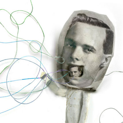
Chucklehead CD
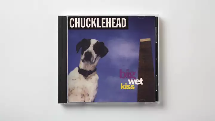
Our first music package design happened—as these things do—because the boyfriend of a friend from college was in the band. Chucklehead (on their EnuffaMyButt record label) was a fun party band with quite a following on the East Coast. I didn’t have much to work with for the images, so I got a lot of practice on the newly introduced—and still magical—Photoshop. (One of my favorite shows was when they opened for the Village People. Yes, those Village People.)
-
04
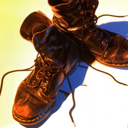
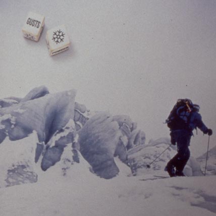
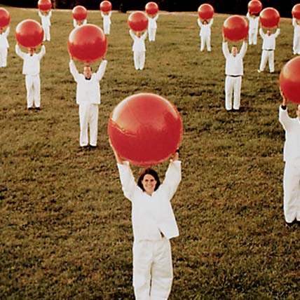
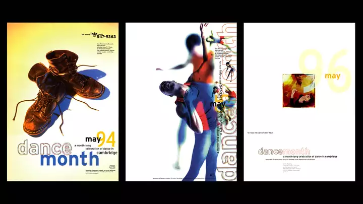
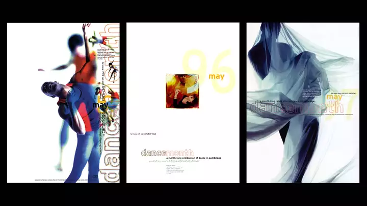
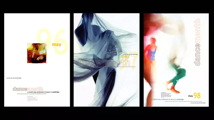
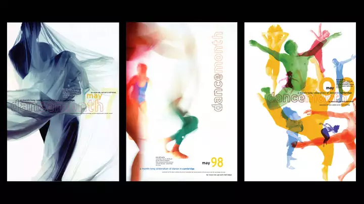
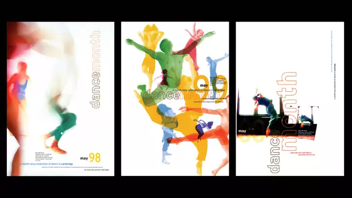
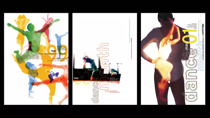
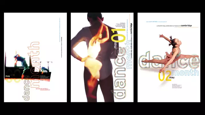
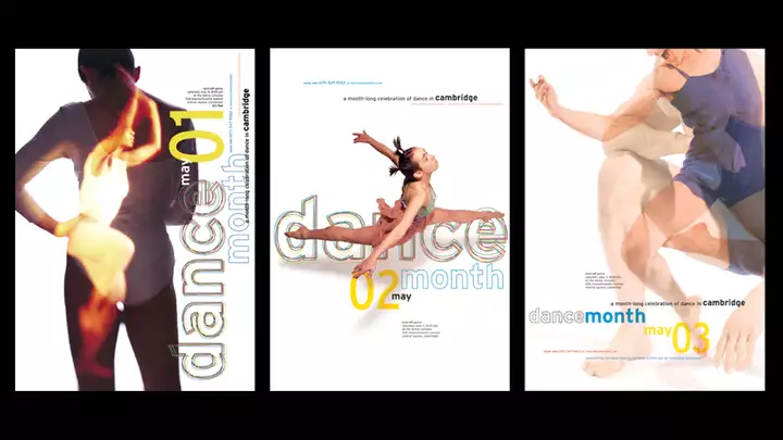
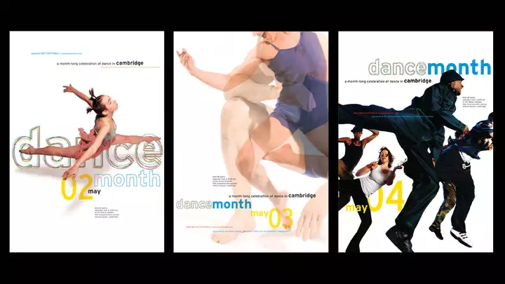
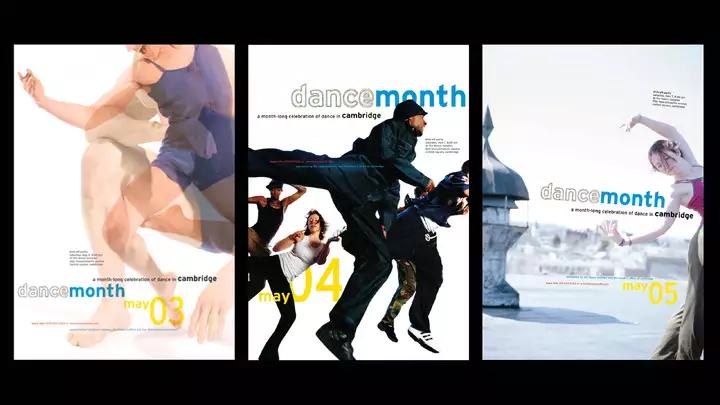
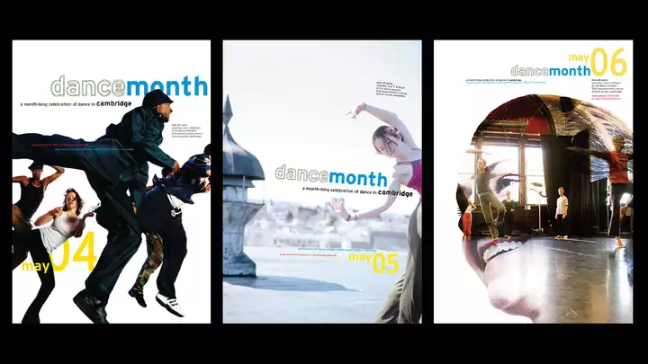
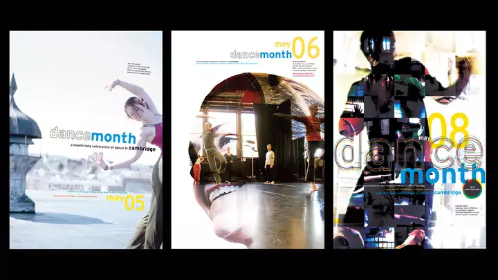
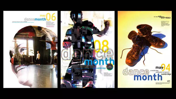
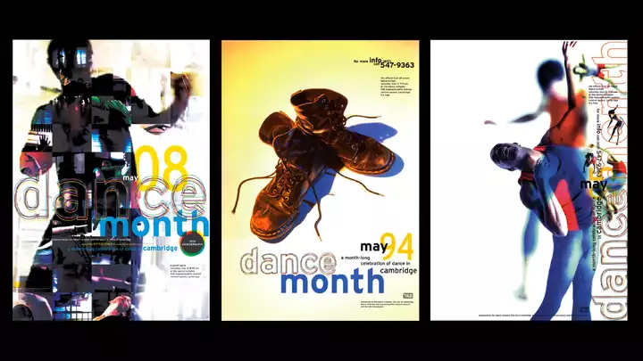
Dance Month Posters
prevnextWhen Dance Month posters popped up along Mass Ave., we knew the long, cold, gray winter was finally over. For 12 years we collaborated with different photographers each year to create the posters announcing Dance Month in Cambridge, with the Dance Complex in Central Square as the epicenter.
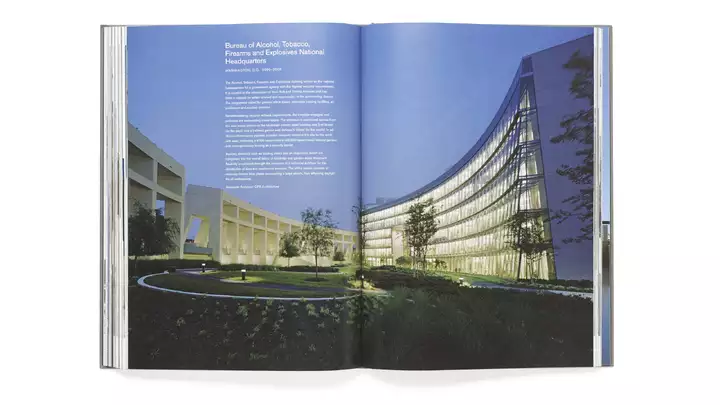
-
-
05
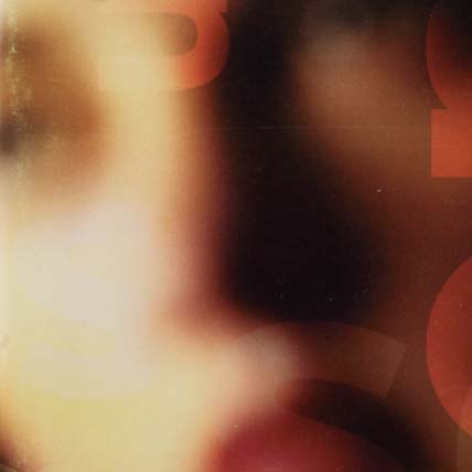
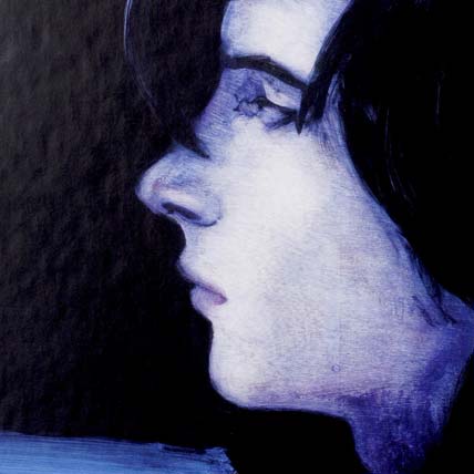
Soon CD
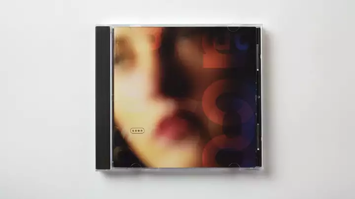
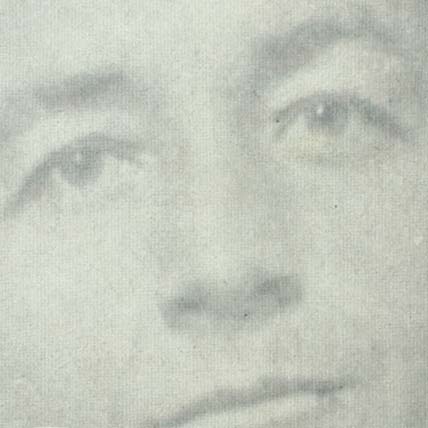
Years before she became in impresario in New York City, Cynthia Von Buhler was an illustrator, performance artist, and mistress of ceremonies living in a purple Victorian house in Allston. At the height of the AIDS crisis she brought together local bands and leading illustrators to produce a CD to raise money for AIDS Action. We designed the “Soon” album featuring a photo of Cynthia (of course) on the cover.
-
06
BU Dental website
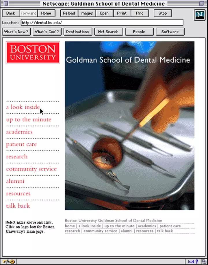
It may not look like much now, but back in 1994 this website was state-of-the-art! Few schools or companies even had websites but when BU Dental School—whose alumni magazine we designed—asked us if we did websites, we said, “Of course!” (Then quickly called Adam Buhler who actually programmed it for us.)
-
07
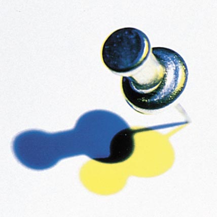
AIGA Pin-Up Party Poster
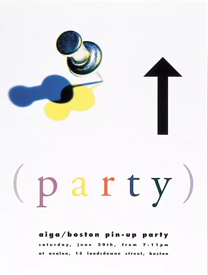
During the early years in Boston, I became involved in AIGA (American Institute of Graphic Arts), heading the lecture committee with Clif Stoltze. In order to encourage connections between designers, we created the Pin-up Party (not that kind of pin-up) where designers put up one piece of their work along with a Polaroid portrait and their credit to connect names with faces with work. (Also an early project with long-time friend and collaborator photographer Kent Dayton.)
-
08
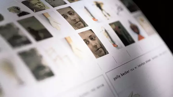
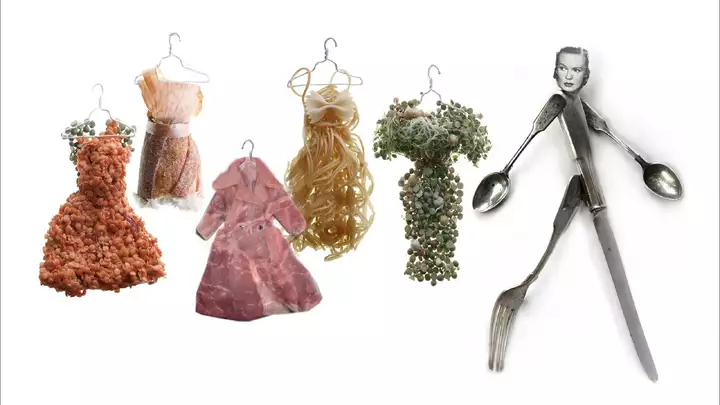
Polly Becker Identity
prevnextMoving to Boston without knowing anyone, one of the first orders of business was to hire some friends. We hired illustrator Polly Becker (recommended by Scott Nash at Corey McPherson Nash) for a book cover and later created branding and promotional materials for her. I’m proud to say that after all these years later we remain collaborators, neighbors, and friends.
-
-
09
Crabtree & Evelyn website
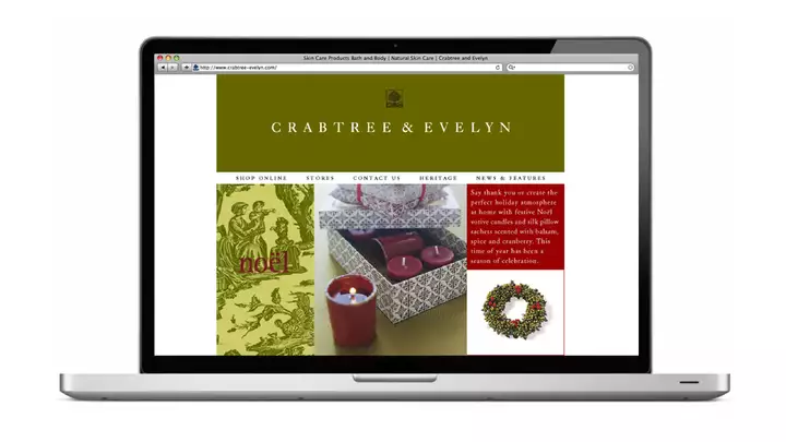
Way back in 1999, Paul Niski, the creative director of Crabtree & Evelyn who was tasked with re-inventing the brand, hired us to re-design their website. Today, Paul runs Good on Beacon Hill—one of Boston’s best shops—and we remain friends all these years later.
-
10
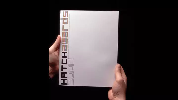
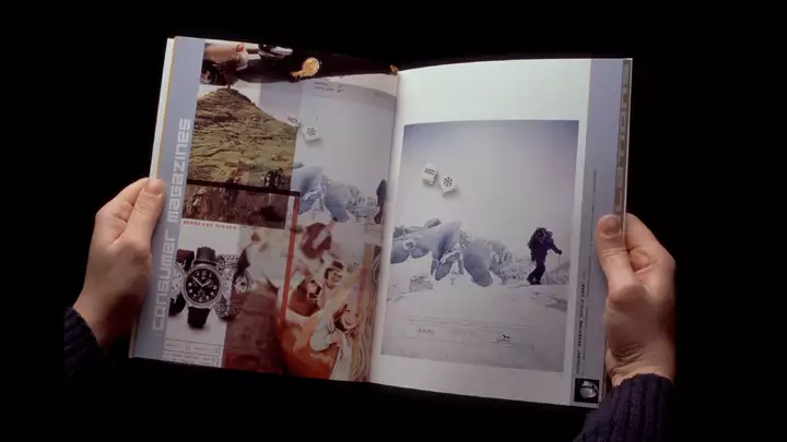
Hatch Awards book
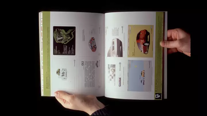
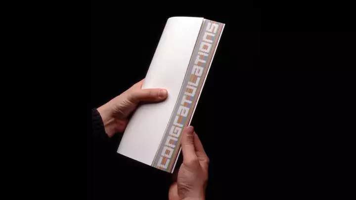
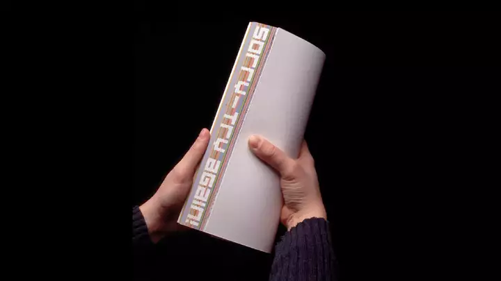
prevnextThe Ad Club of Boston came to us to create the catalogue for the Hatch Awards which represent “creative excellence” in advertising. But we quickly realized their previous awards books were neither “creative” nor “excellent.” Playing with the print form, we injected design ideas both big and small, including the edge-printed message to folks who entered work that year: “congratulations” or “sorry—try again!”
-
-
11
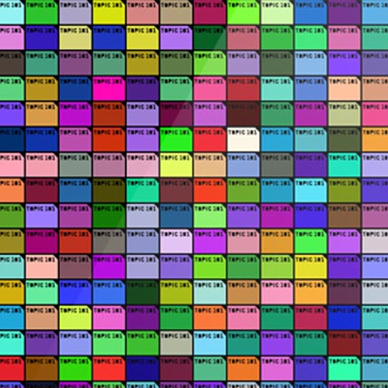
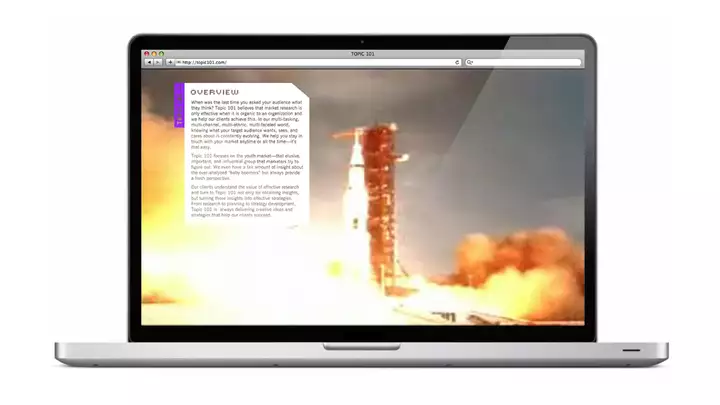
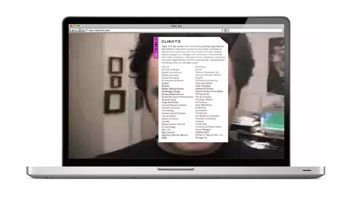
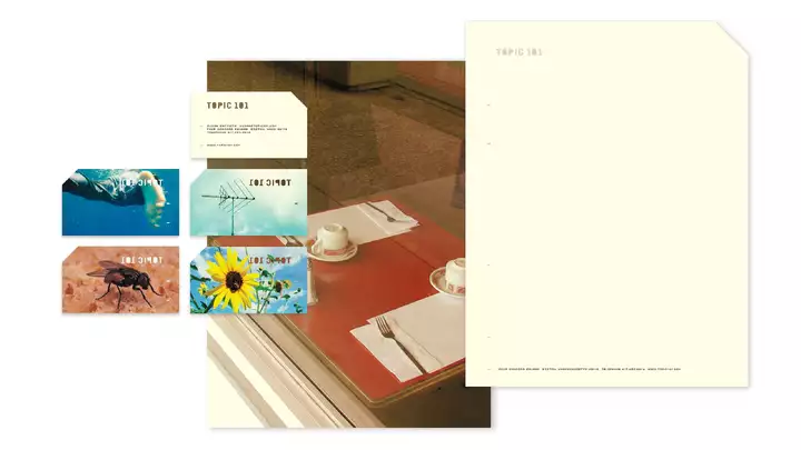
Topic 101 branding
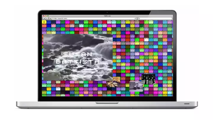
prevnextWhen Susan Battista, a market research consultant and strategist who had worked with some of Boston’s biggest companies and agencies, came to us needing branding for her new start up, neither of us could foresee what it would lead to. We eventually merged businesses—and lives. (Sorry we can’t link to one of the most eye-popping sites we ever created—it was done in Flash. Remember Flash?)
-
-
12
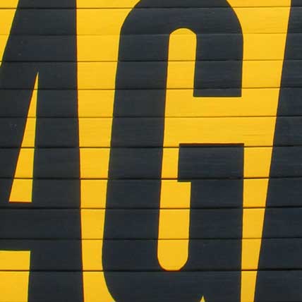
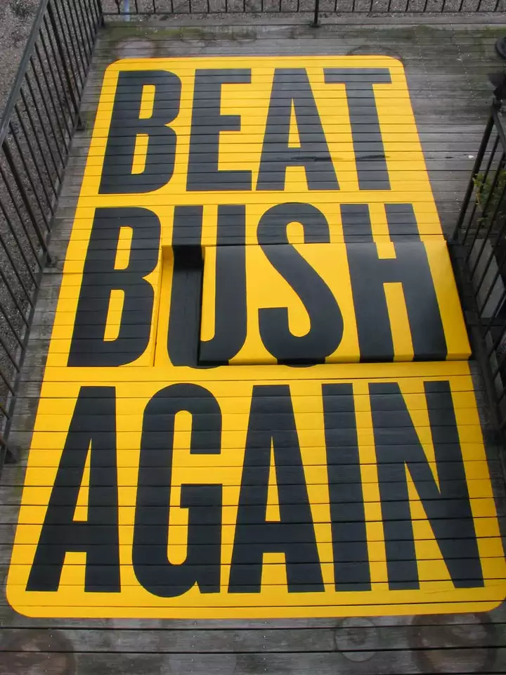
Beat Bush Again sign
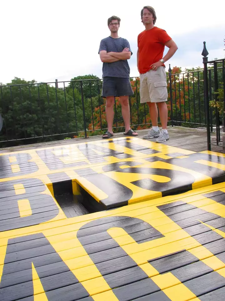
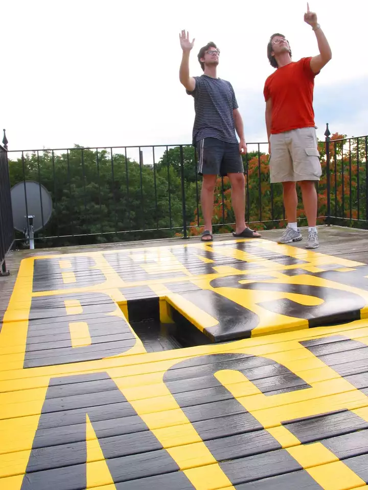
prevnextWhile many Bostonians complained about the 2004 Democratic National Convention coming to town, we saw it as the best opportunity to right the stolen election of 2000. (Remember those hanging chads in Florida?) So we thought we’d shout it from the rooftops, welcoming delegates to Boston with our hand-painted message (with the help of Doug Weathersby). Sadly the election didn’t go our way so let’s make sure the next election does!
-
-
13
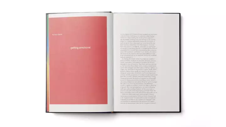
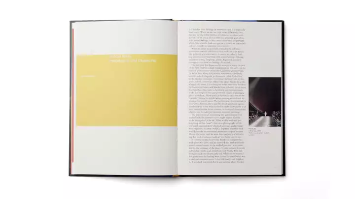
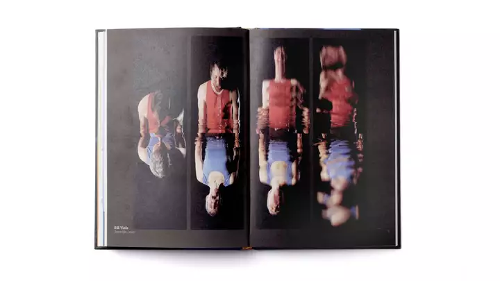
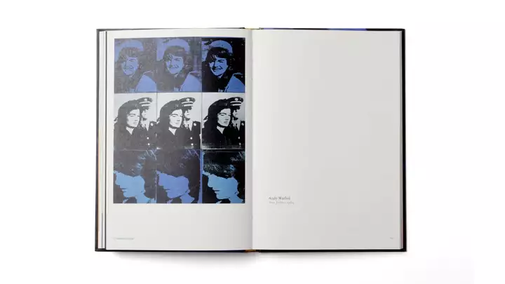
ICA catalogue
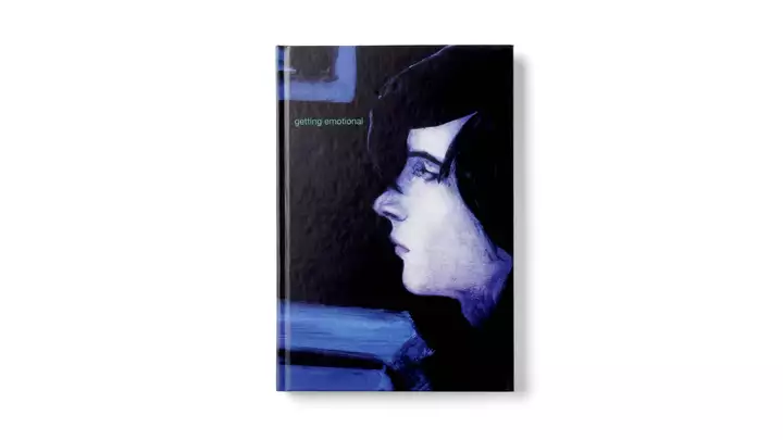
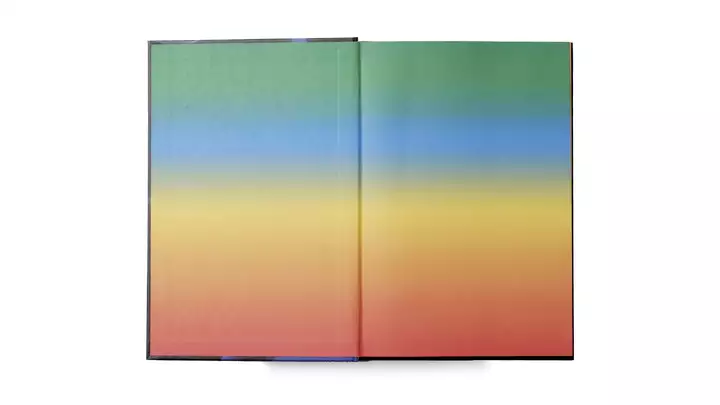
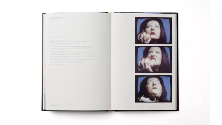
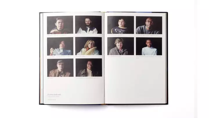
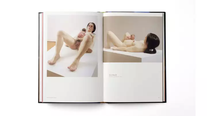
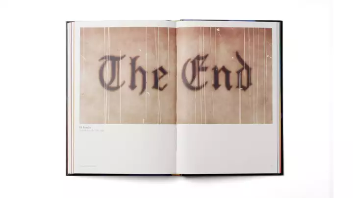
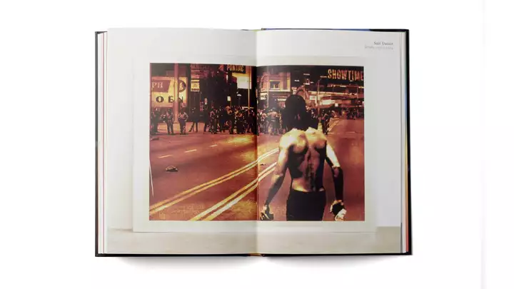
prevnextWorking with the Institute of Contemporary Art through their transition from the Back Bay to the waterfront, we sought to elevate their level of design. For the exhibition “Getting Emotional,” curated by Nicolas Baume, a who’s who of contemporary artists are presented (a handy guide for our subsequent trips to Art Basel).
-
-
14
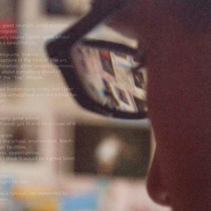
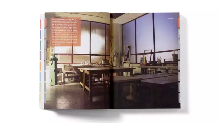
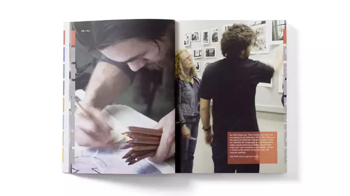
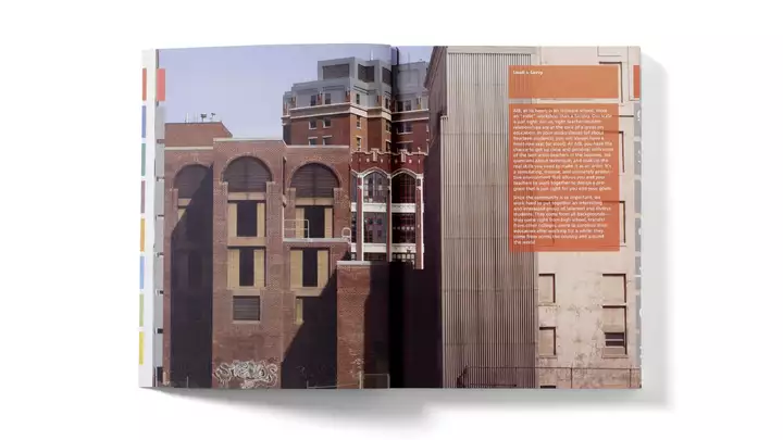
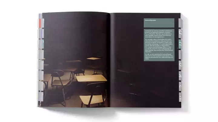
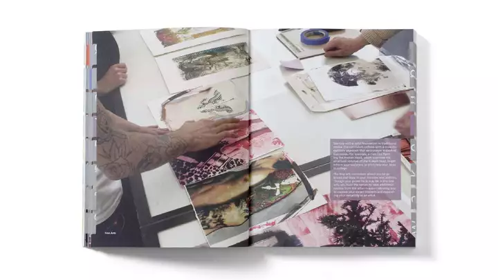
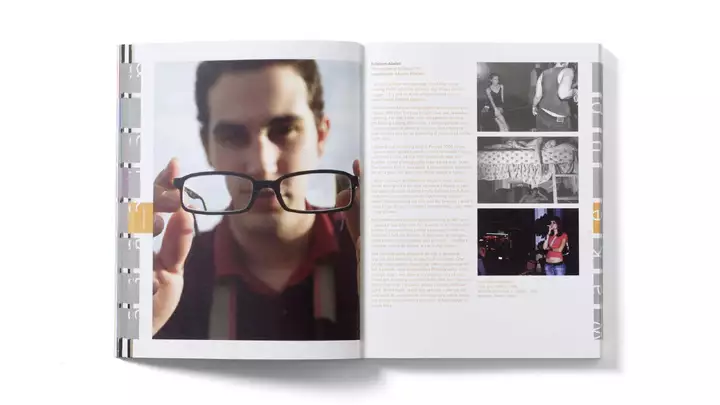
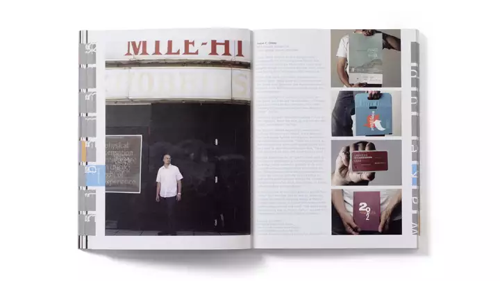
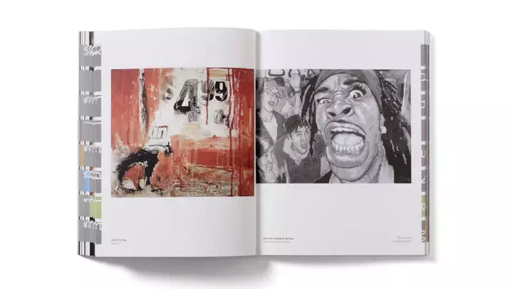
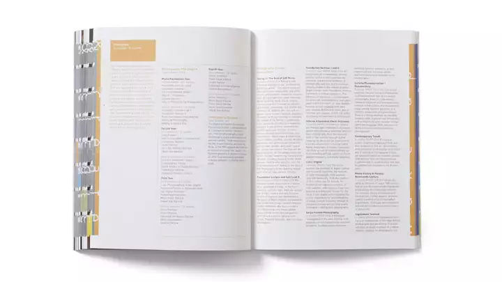
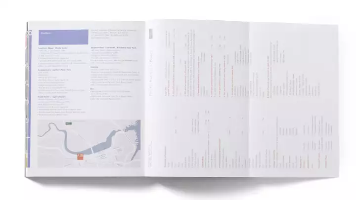
Art Institute of Boston viewbook
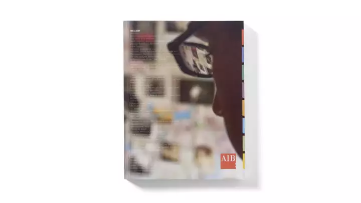
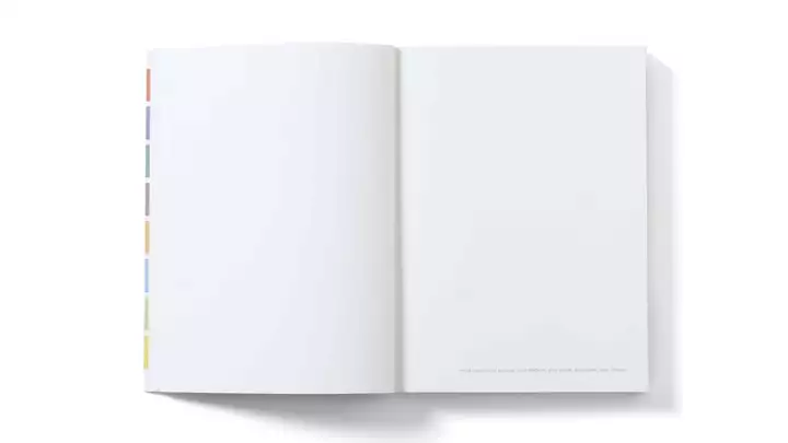
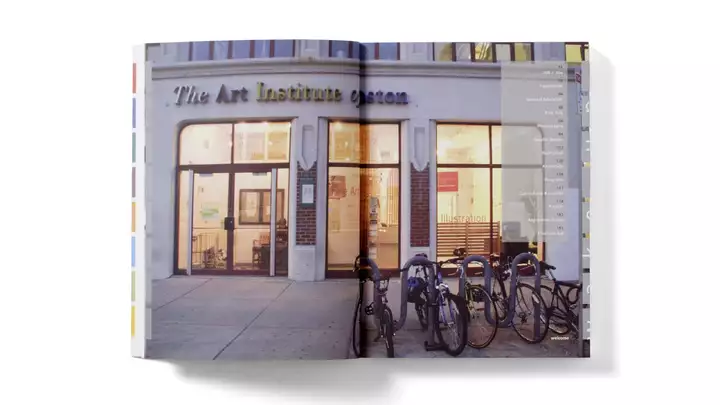
prevnextIn creating the viewbook for what is now Lesley University College of Art & Design, we tapped the top photo students to visually tell the story of the school from a student perspective—warts and all. The end result: applications doubled.
-
-
15
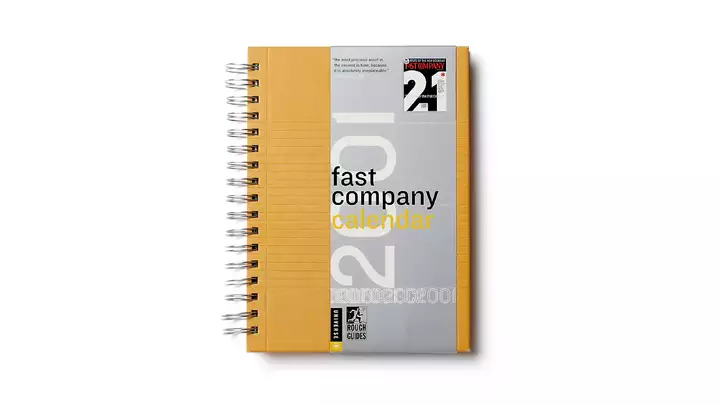
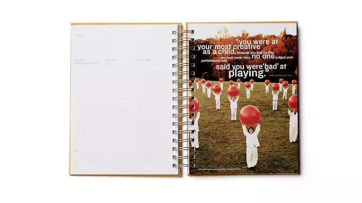
Fast Company Calendar
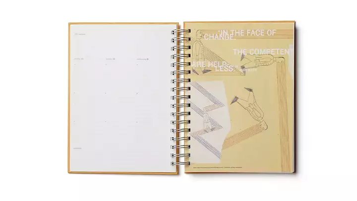
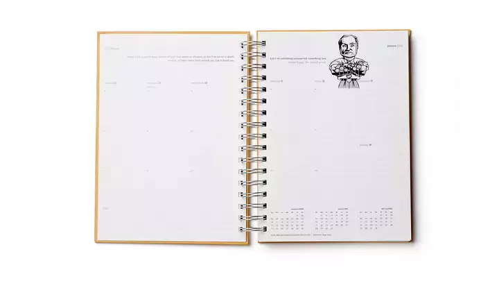
prevnextFast Company magazine helped define the zeitgeist of a new way of thinking about business. Working with creative director (and magazine design guru) Pat Mitchell, we translated the spirit of the magazine—along with its best artwork and ideas—into a handy, printed calendar. (Remember those?)
-
-
16
Moshe Safdie Monograph
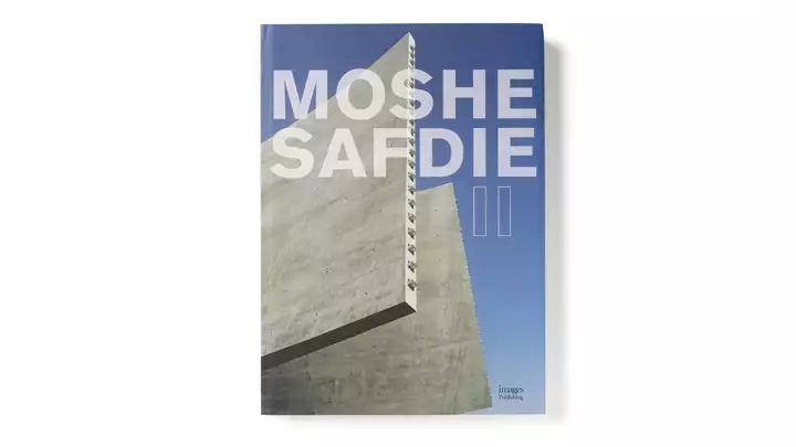
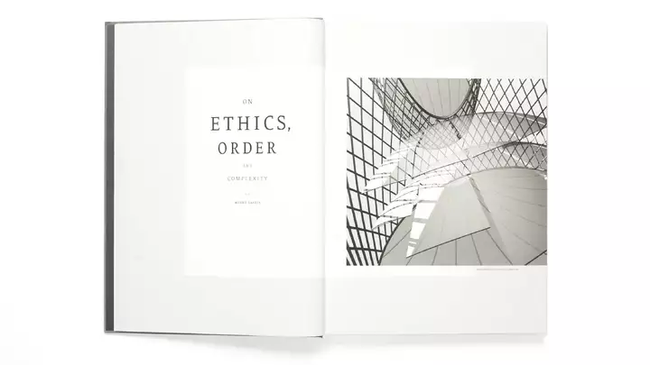
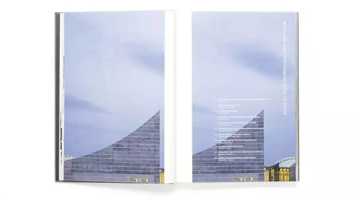
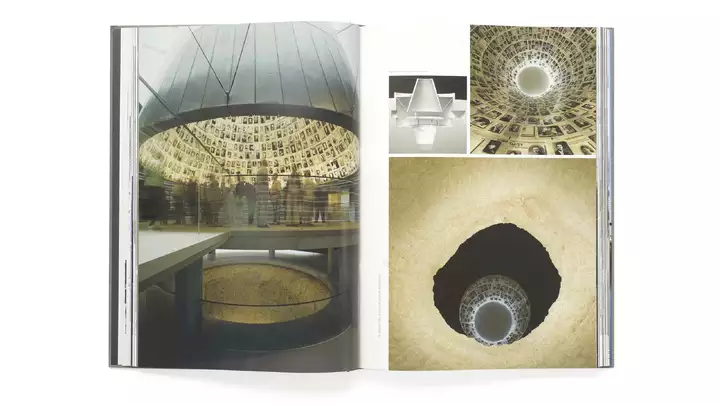
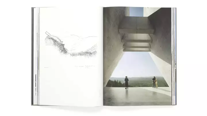
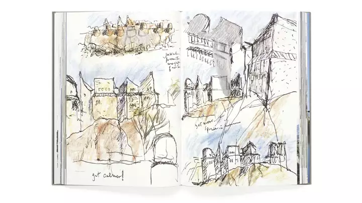
prevnextWorking one-on-one with one of the world’s greatest living architects was an inspiring experience. I told Moshe I remember as a kid making a pilgrimage with my dad, who was also an architect, to see his Habitat in Montreal (which he designed at the age of 26). Moshe said he went the other way to see Mies van der Rohe’s Lafayette Park in Detroit where I grew up.
-
-
17
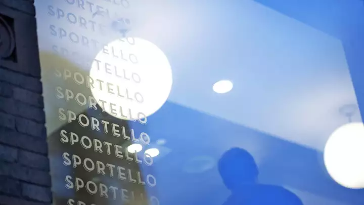
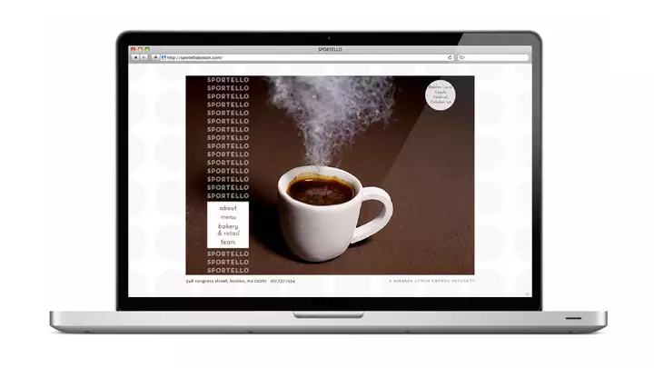
Sportello Identity
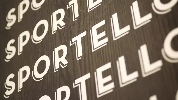
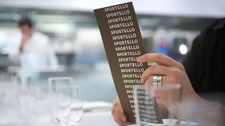
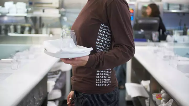
prevnextWhile she can talk all day about truffles, getting Barbara Lynch to talk about branding was tough, but we got there. Combining the counter from her first job at Brigham’s with her love of modern Italian cuisine, Sportello (“counter” in Italian) as well as Drink—her bar below—helped transform the Seaport and change the restaurant scene in Boston.
-
-
18
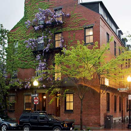
Rutland Street interiors
Long before WeWork made the office feel more like home, we made a home that featured an office. We created a work/live space for Visual Dialogue’s staff, our family, friends, visitors, and clients. We collaborated with architects Stern McCafferty to inject a bit of Mies van der Rohe into a gut renovation of an 1850 rowhouse in Boston’s historic South End. (Keep your eyes peeled for a glimpse of Shepard Fairey’s installation on our exterior in the video.)
-
19
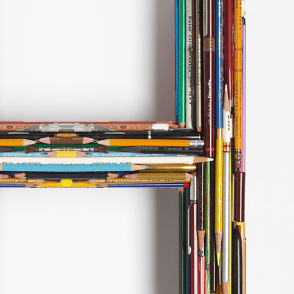
Matthew Carter poster
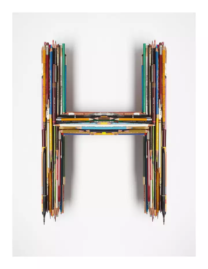
When AIGA Boston wanted to honor one of the most celebrated type designers of all time, they asked 13 designers to each create a poster based on a letter of Matthew’s name. I thought my letter was “T” but later—after having already constructed my object out of my old graphic design tools—found out it was actually “H.” In the end, the Photoshopped revision mirrors Matthew’s evolution from analog to digital.
-
20
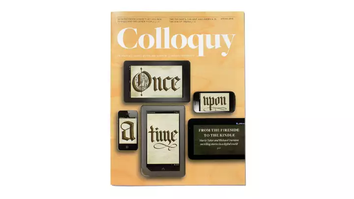
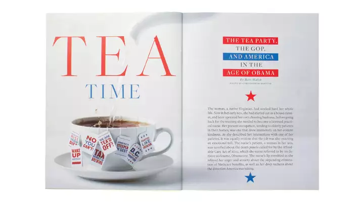
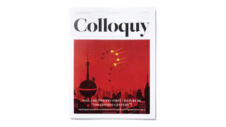
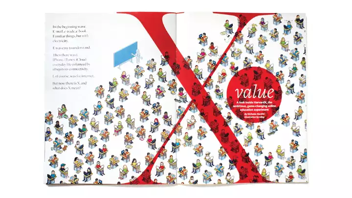
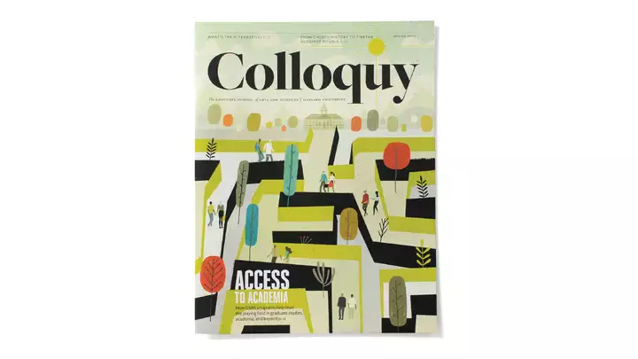
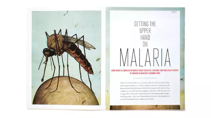
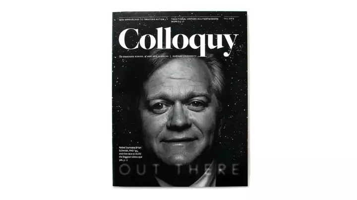
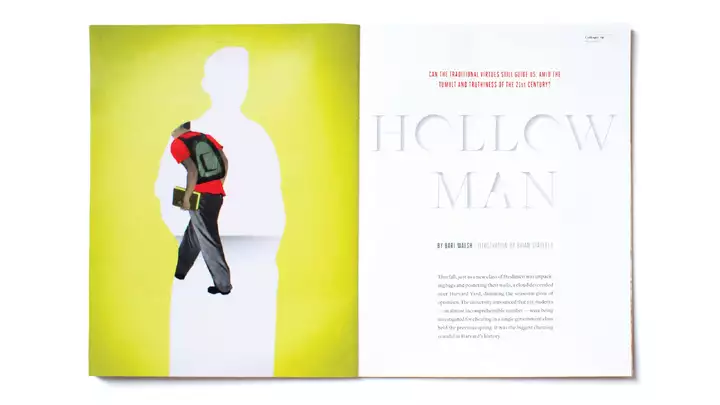
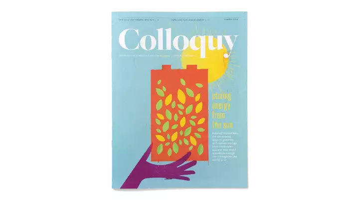
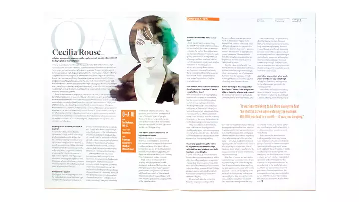
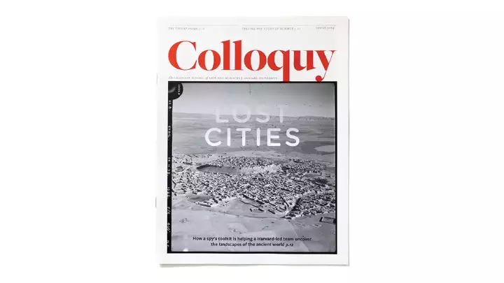
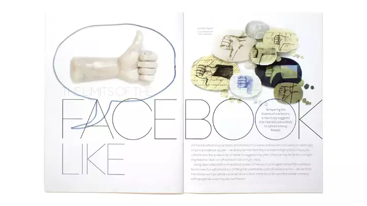
Colloquy Magazine
prevnextWhy don’t scholars get the same recognition as celebrities in our culture? To help right this imbalance, our goal with the redesign of the Harvard’s Graduate School of Arts & Sciences alumni magazine was to give students and faculty—and their work—the attention they deserve through compelling photography, illustration, and design.
-
-
21
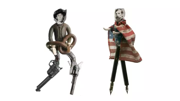
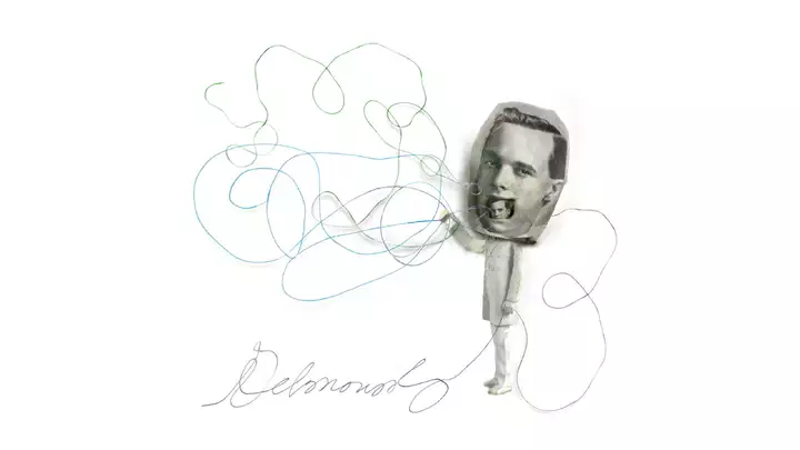
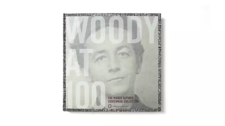
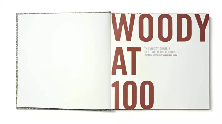
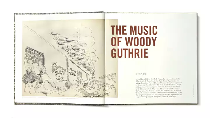
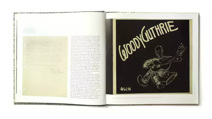
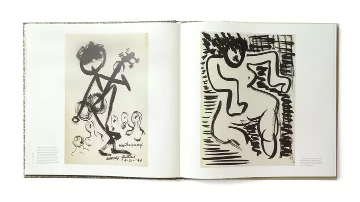
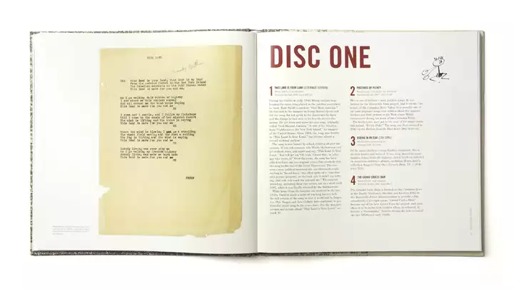
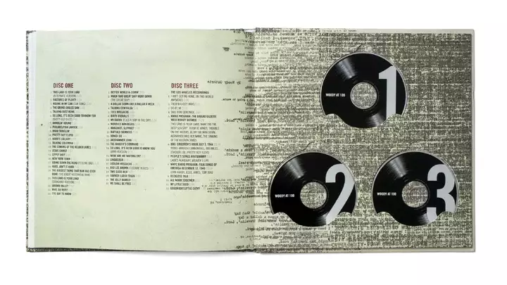
Woody at 100 Box Set
prevnextAfter working with Folkways for over 20 years, being honored with a stroll down the red carpet as a Grammy nominee is a surreal experience. When they say “The Grammy goes to…” and you hear your name, you make your way to the stage, and Kacey Musgraves hands you a gold gramophone—that takes it to the next level.
-
-
22
Turn it Around campaign
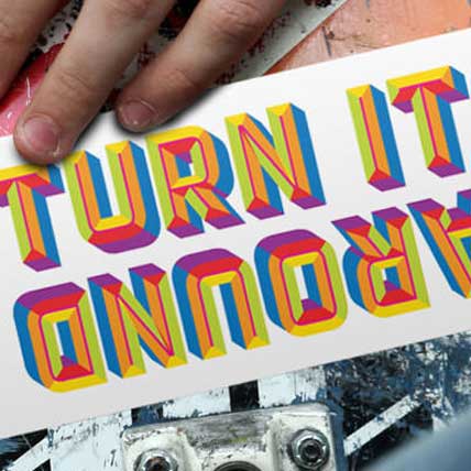
Mass General Hospital was early to recognize how the abuse of prescription painkillers leads to the kind of opioid addiction we see in our communities today. Charlestown has been one of Boston’s hardest hit neighborhoods, so Mass General teamed with the Boys & Girls Club of Charlestown to create an awareness campaign directed at teens. Working closely with the teens at the Club, we identified both the issues that lead to prescription drug abuse and the desire to address these problems. We’re proud to say the “Turn It Around” initiative is still going strong and a new wave of teen leaders has made it their own.
-
23
1630 pop-up shoppe
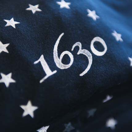
With all its tourists and local pride, we wondered why Boston didn’t have a great gift shop focusing on curated local goods and history. So we created (and operated!) one. 1630 (named after the year Boston was founded) first popped up on Newbury Street, then moved to Faneuil Hall where this “holiday pop-up” turned into a three year run. In addition to the locally-made goods, vintage items, and custom products we created, we also devoted half of our prime ground-floor space to an ever-changing experiential space.
-
24
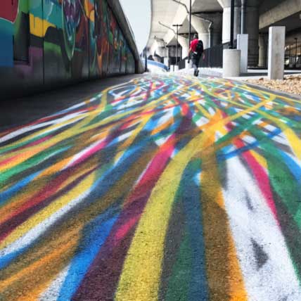
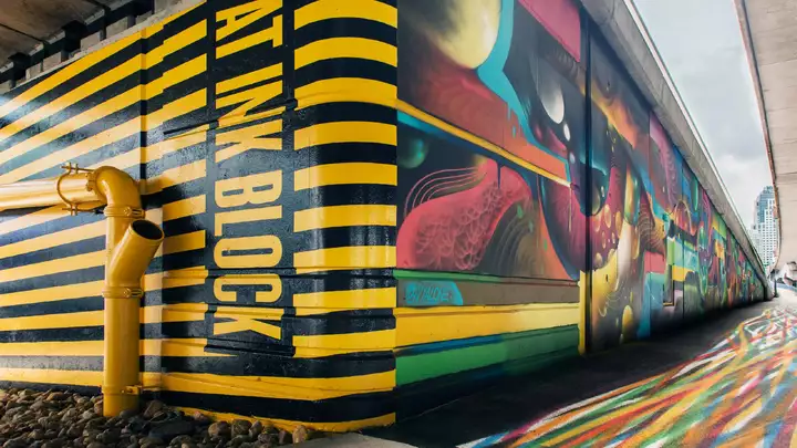
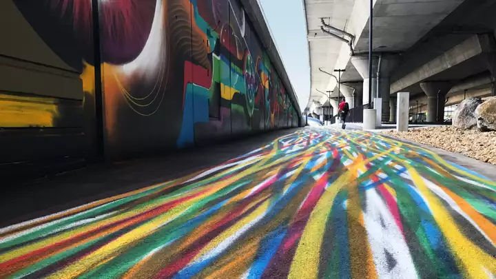
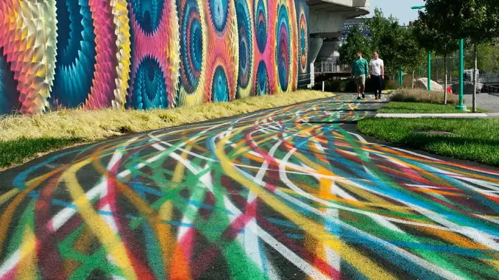
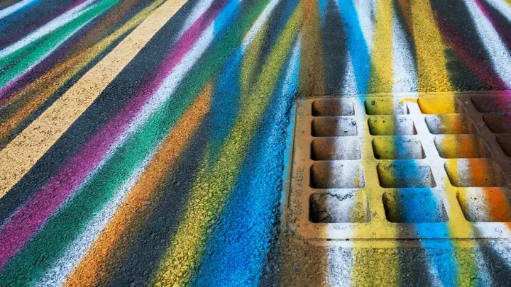
Underground artpark
prevnextSituated in one of the most unusual locations imaginable for a park, Underground sits below the I-93 highway leading in and out of Boston. While it includes an unexpectedly beautiful park by Landing Studio and a visual playground of street art, our branding entry mural and wayfinding stripes bring eyes (and feet) into it.
-
-
25
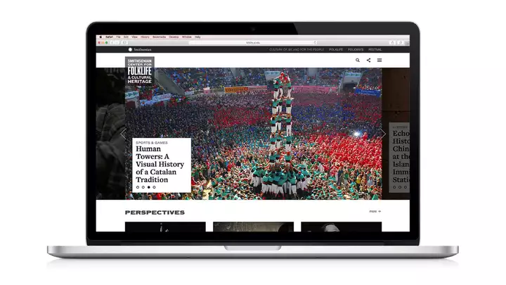
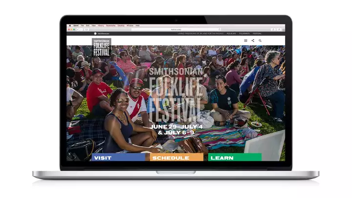
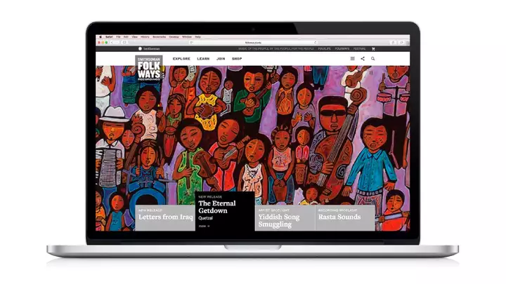
Smithsonian Websites
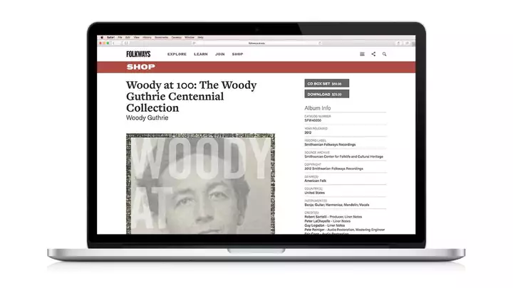
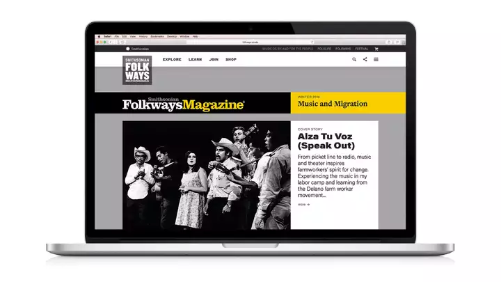
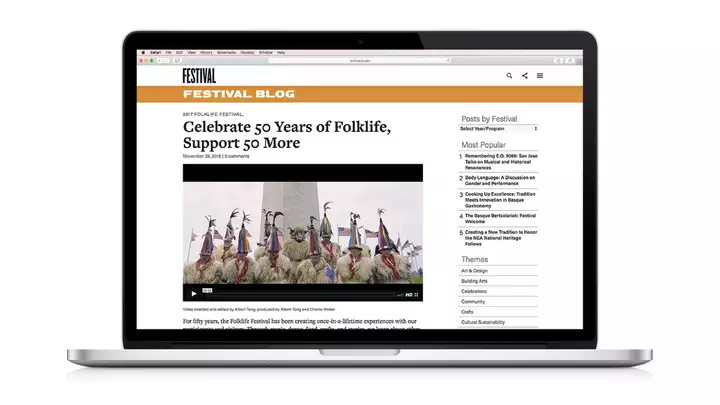
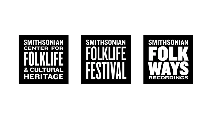
prevnextAfter working with our friends at the Smithsonian in DC for over 20 years on hundreds of music packaging projects, they asked us if we designed websites as well. We created three new sites for them that function almost as online exhibitions, bringing together music, video, and multimedia features (and we gave them new logos, too).
-
-
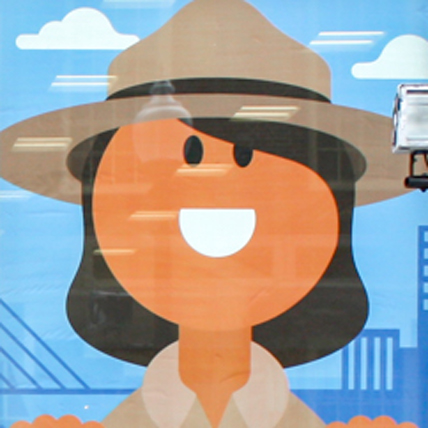
26
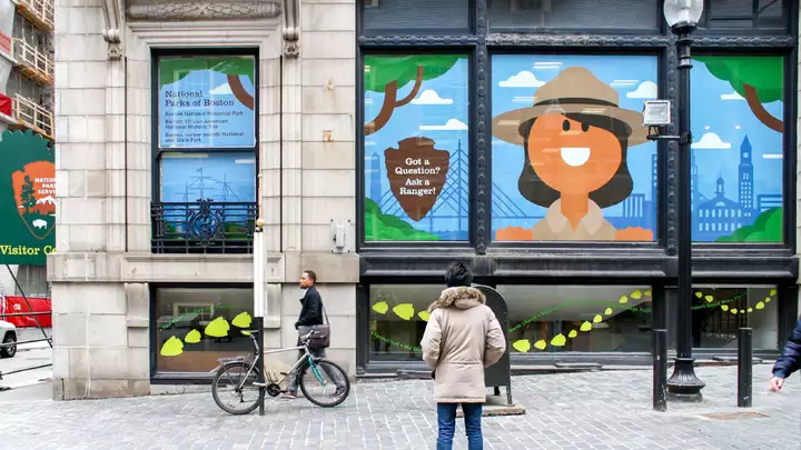
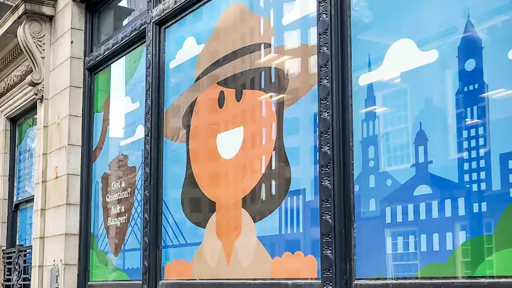
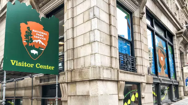
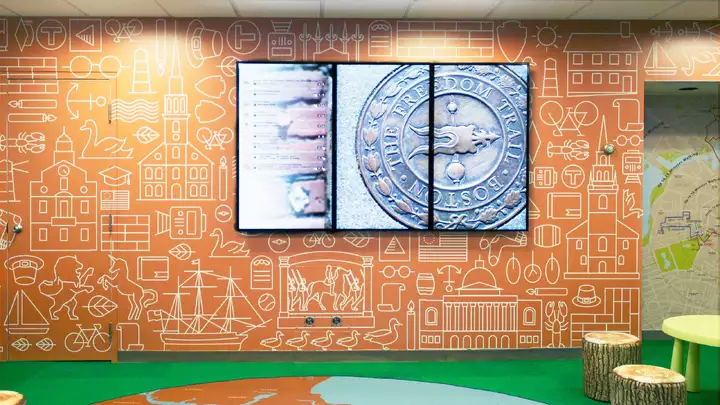
National Park Service Pop-up
prevnextWhen the National Park Service had to move out of their Faneuil Hall location due to construction, they asked us to transform a basement cubicle farm into a welcoming visitor center. And who better than a giant smiling park ranger to get attention and invite people into the newly created space?
-
-
27
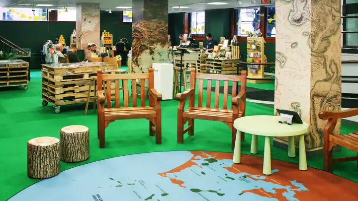
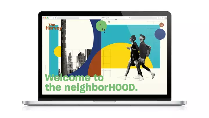
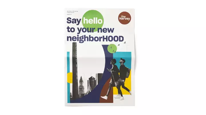
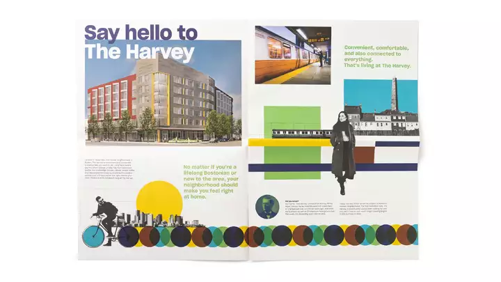
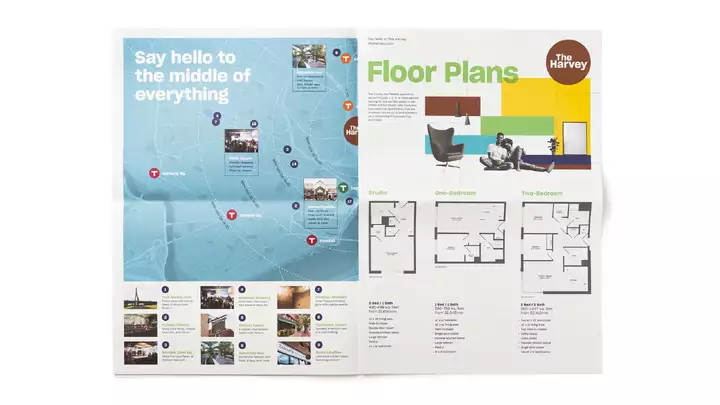
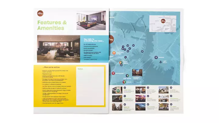
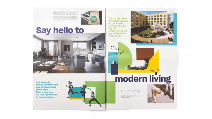
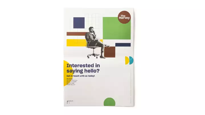
The Harvey Identity
prevnextAs part of the re-imagining of Hood Park in Charlestown (the location of the former Hood Dairy bottling plant), we created the brand for the first residential building on the 20-acre site. Named after Harvey Perley Hood, the founder of the dairy, The Harvey name and visuals give a lively spin to a category often represented by pretentious copy-cat looks.
-
-
28
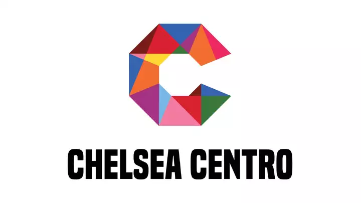
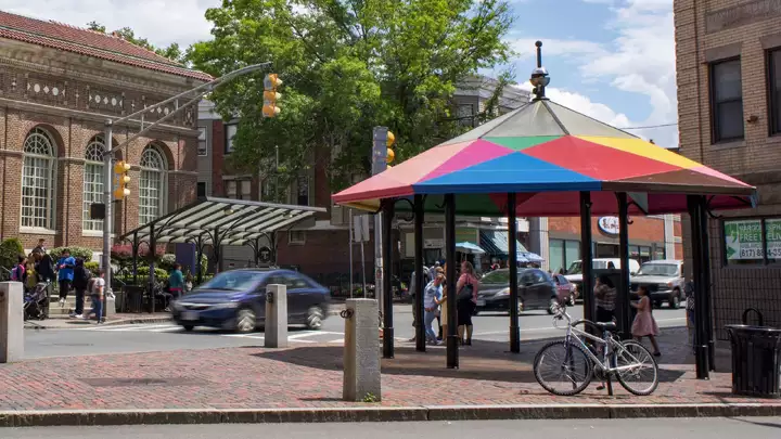
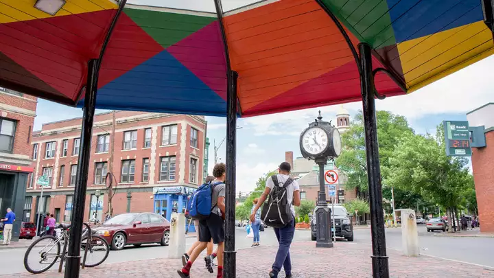
Chelsea Placemaking
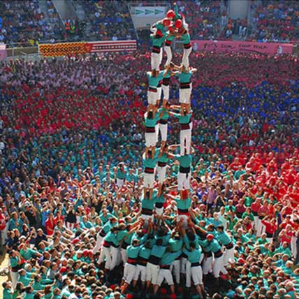
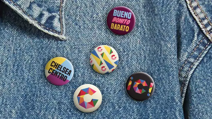
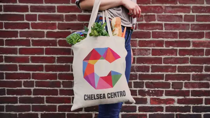
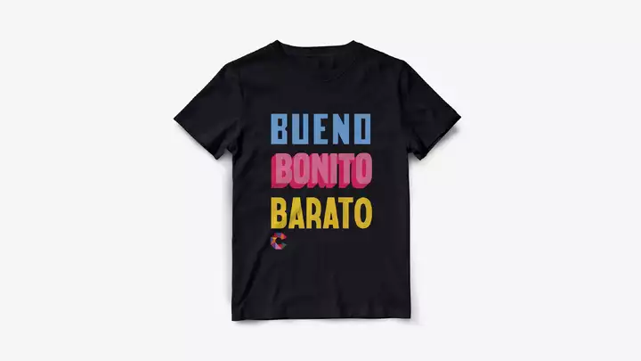
prevnext“Bueno, Bonito, Barato” is the essence of Chelsea. With the highest concentration of Central and South Americans in the state, the branding and placemaking we developed to stimulate economic development in the business district conveys the color, vibrancy, and vitality of Chelsea’s residents and businesses.
-
-
29
Riverview School Branding
This one is personal. Our daughter Ava was accepted to Riverview School on Cape Cod which has provided tremendous services for students with complex learning challenges for over 60 years. But their marketing communications had been ignored while they focused on teaching. So we donated our services, updating their brand identity, re-doing their (barely functioning) website and email newsletters, art directing new imagery, and scripting their intro video. (Next up, print publications and dorm interiors.) If you know a student who may be a good candidate for Riverview, feel free to contact us.
-
30
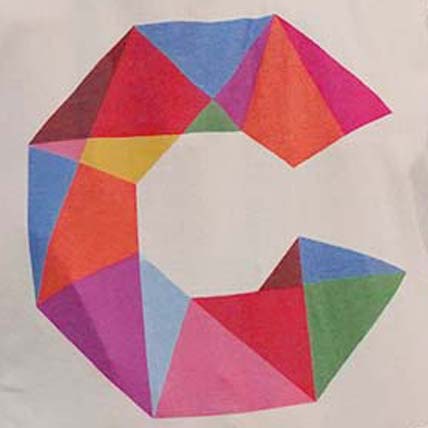
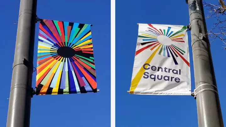
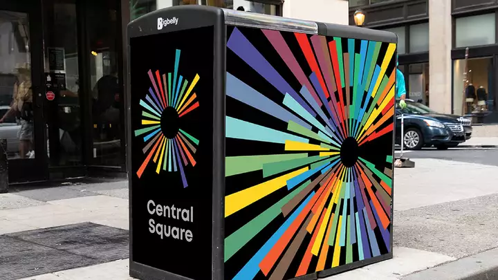
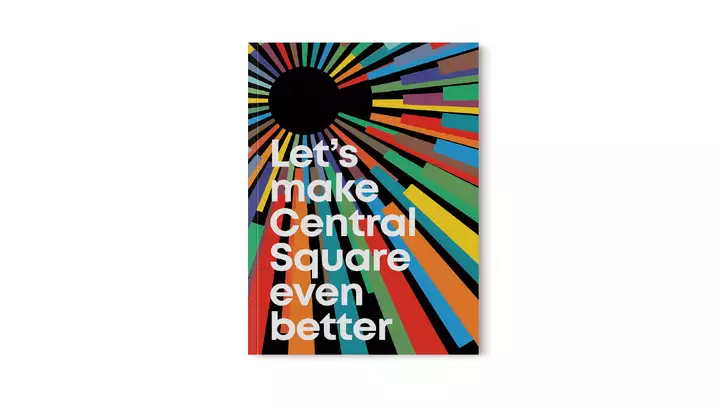
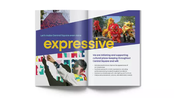
Central Square Identity
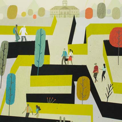
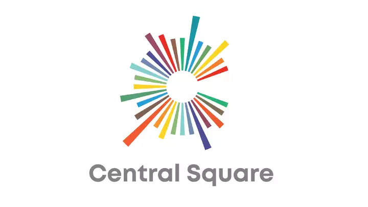
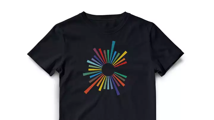
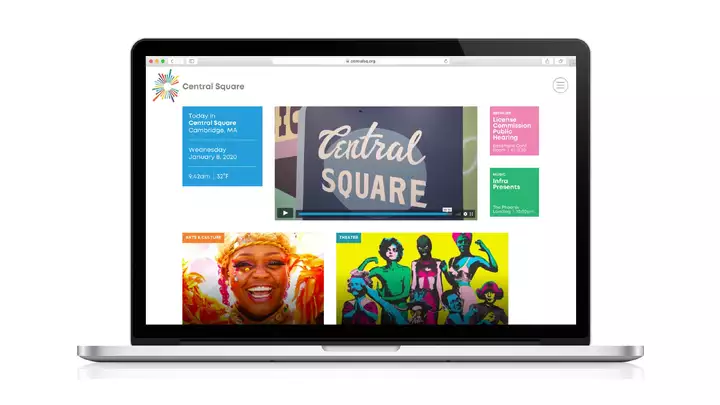
prevnextWe seem to be on a roll branding “squares”—including Union Square, Station Square, and even the restaurant chain Tavern in the Square. After spending 30 years frequenting Central Square, we wanted to develop an expressive look for the area that works today and into the future.
-
-
01Frank Lloyd Wright poster
-
02Coaches Choice Trophy
-
03Chucklehead CD
-
04Dance Month Posters
-
05Soon CD
-
06BU Dental website
-
07AIGA Pin-Up Party Poster
-
08Polly Becker Identity
-
09Crabtree & Evelyn website
-
10Hatch Awards book
-
11Topic 101 branding
-
12Beat Bush Again sign
-
13ICA catalogue
-
14Art Institute of Boston viewbook
-
15Fast Company Calendar
-
16Moshe Safdie Monograph
-
17Sportello Identity
-
18Rutland Street interiors
-
19Matthew Carter poster
-
20Colloquy Magazine
-
21Woody at 100 Box Set
-
22Turn it Around campaign
-
231630 pop-up shoppe
-
24Underground artpark
-
25Smithsonian Websites
-
26National Park Service Pop-up
-
27The Harvey Identity
-
28Chelsea Placemaking
-
29Riverview School Branding
-
30Central Square Identity
