tavern in the square
be there and be square
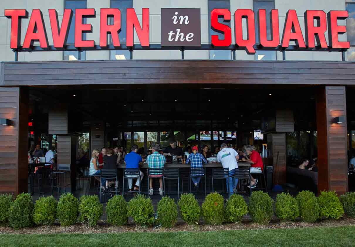
In just over 10 years, Tavern in the Square has grown from a single bar with a “college bro” vibe to a very successful group of nine restaurants located throughout Massachusetts (with more locations opening soon). As the restaurant group owners—and their guests—have become more discerning, the quality of the interiors, food, and drinks had consistently increased. But their overall branding remained an amateurish hodgepodge with a downscale look.
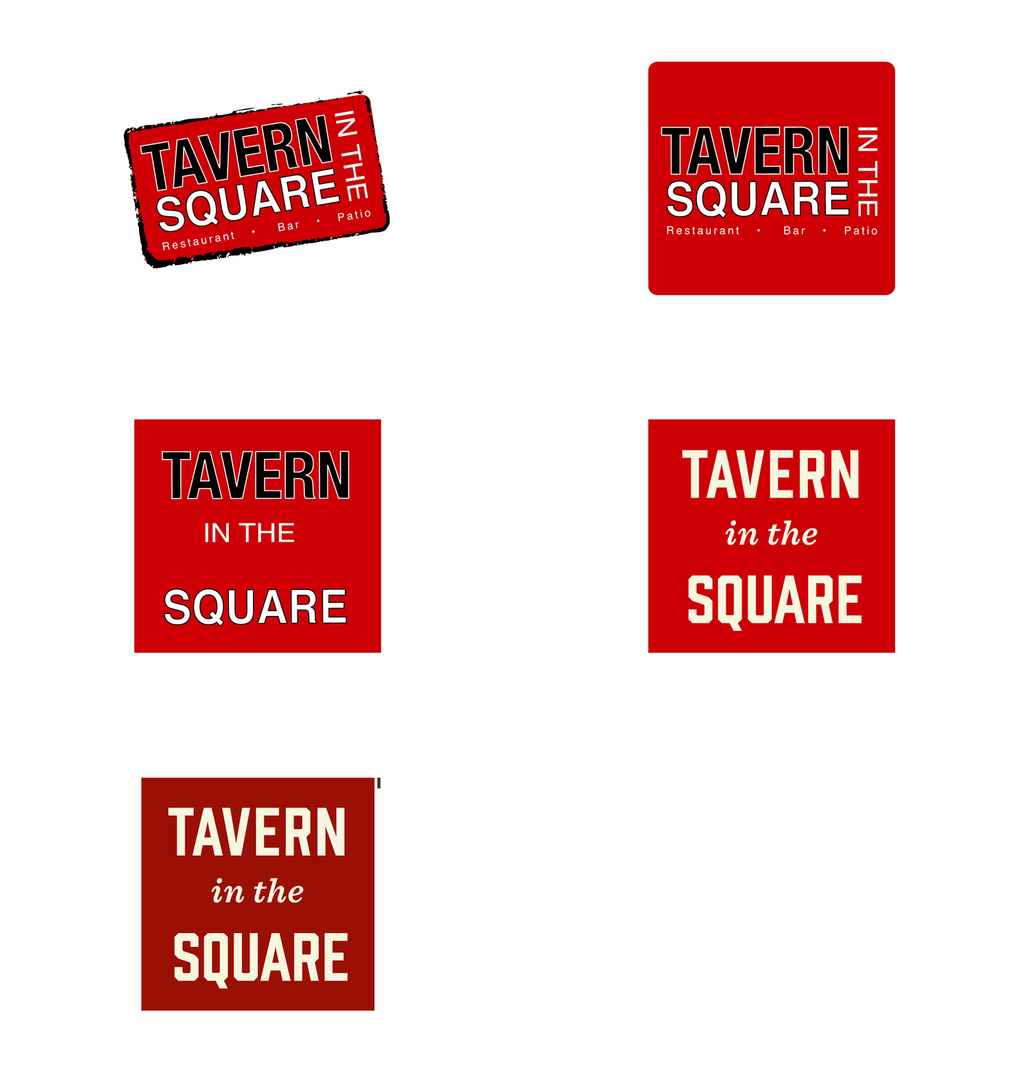
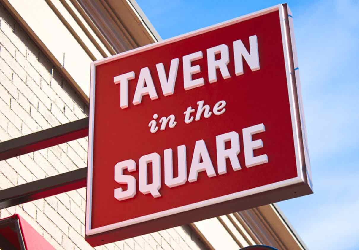
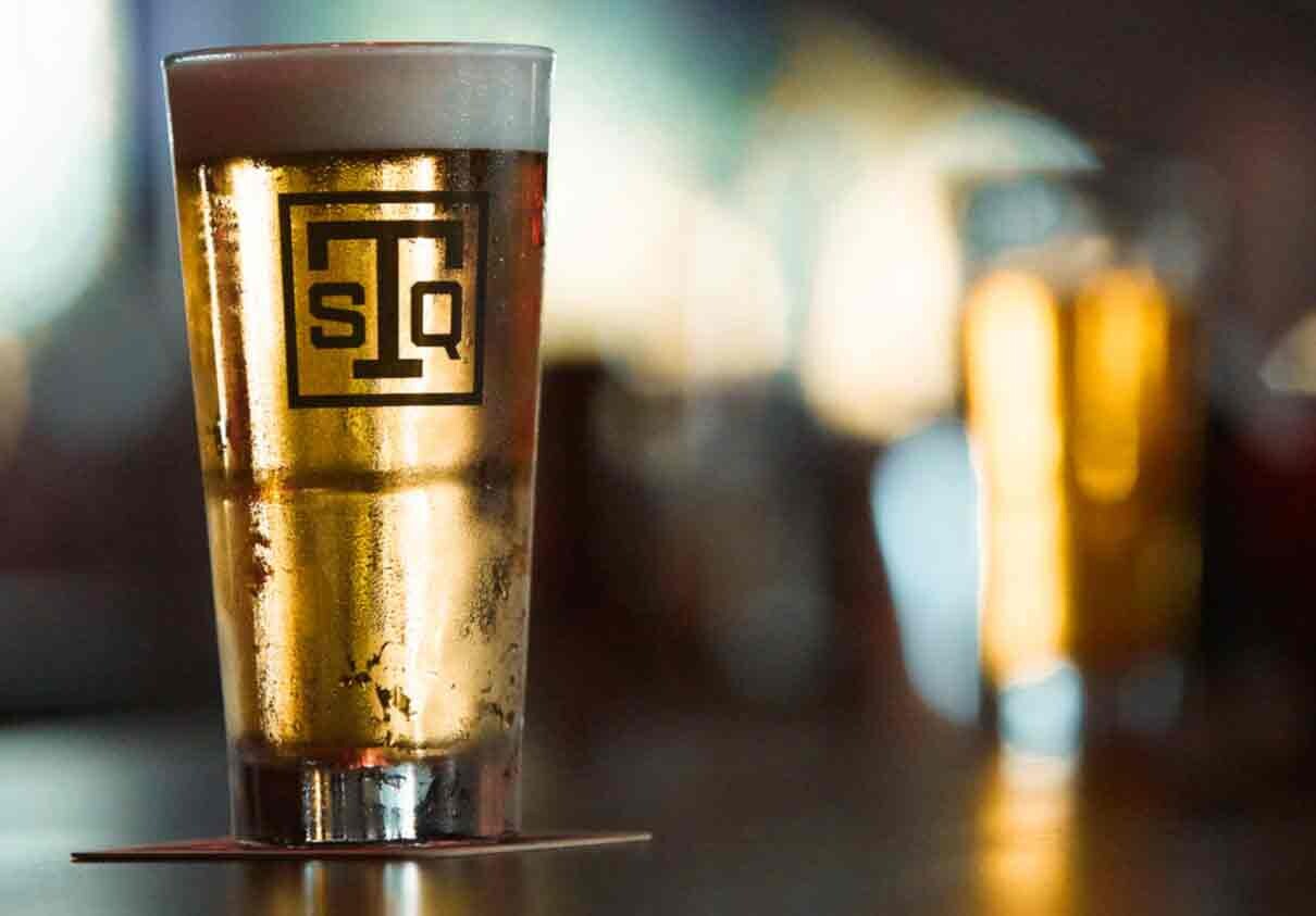
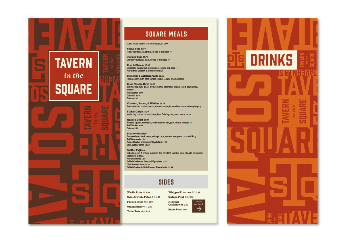
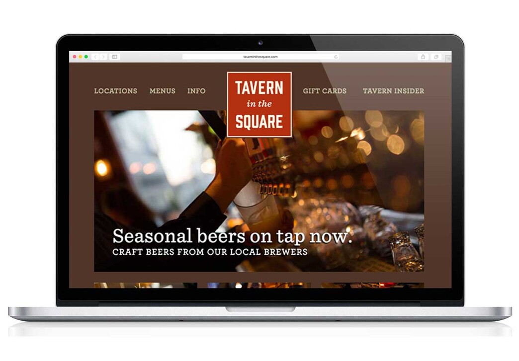
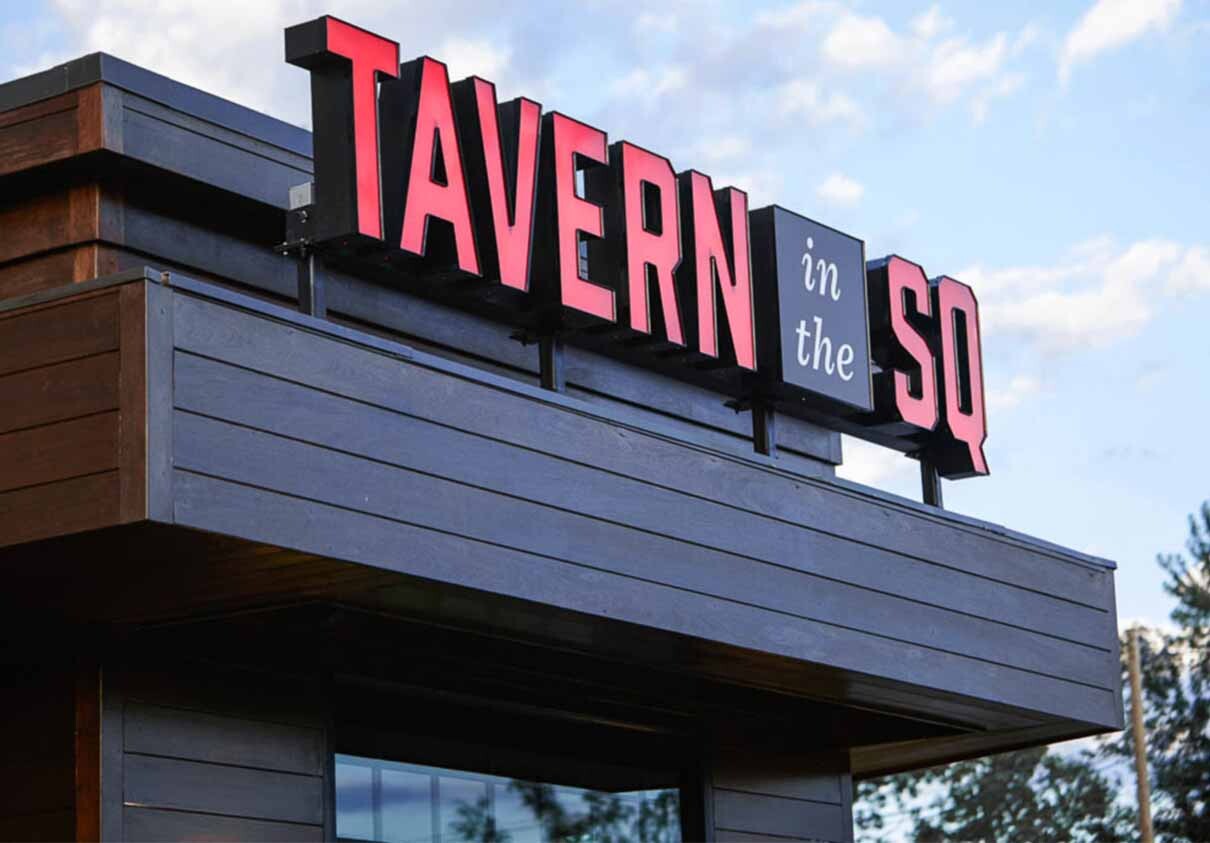
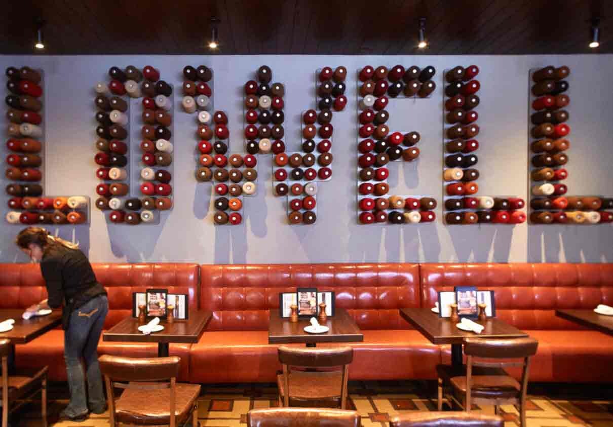
Visual Dialogue was brought in to remake every aspect of the Tavern brand—starting with the logo, then menus, signage-wayfinding, uniforms, ads, website, and even interior artwork. By creating a thought-out system built around a square logo (which seems pretty obvious) along with consistent typefaces, color palette, photography, patterns, and secondary graphics, Tavern now has all the “ingredients” they need to succeed.
