national park service
revolutionary design
rediscovering History
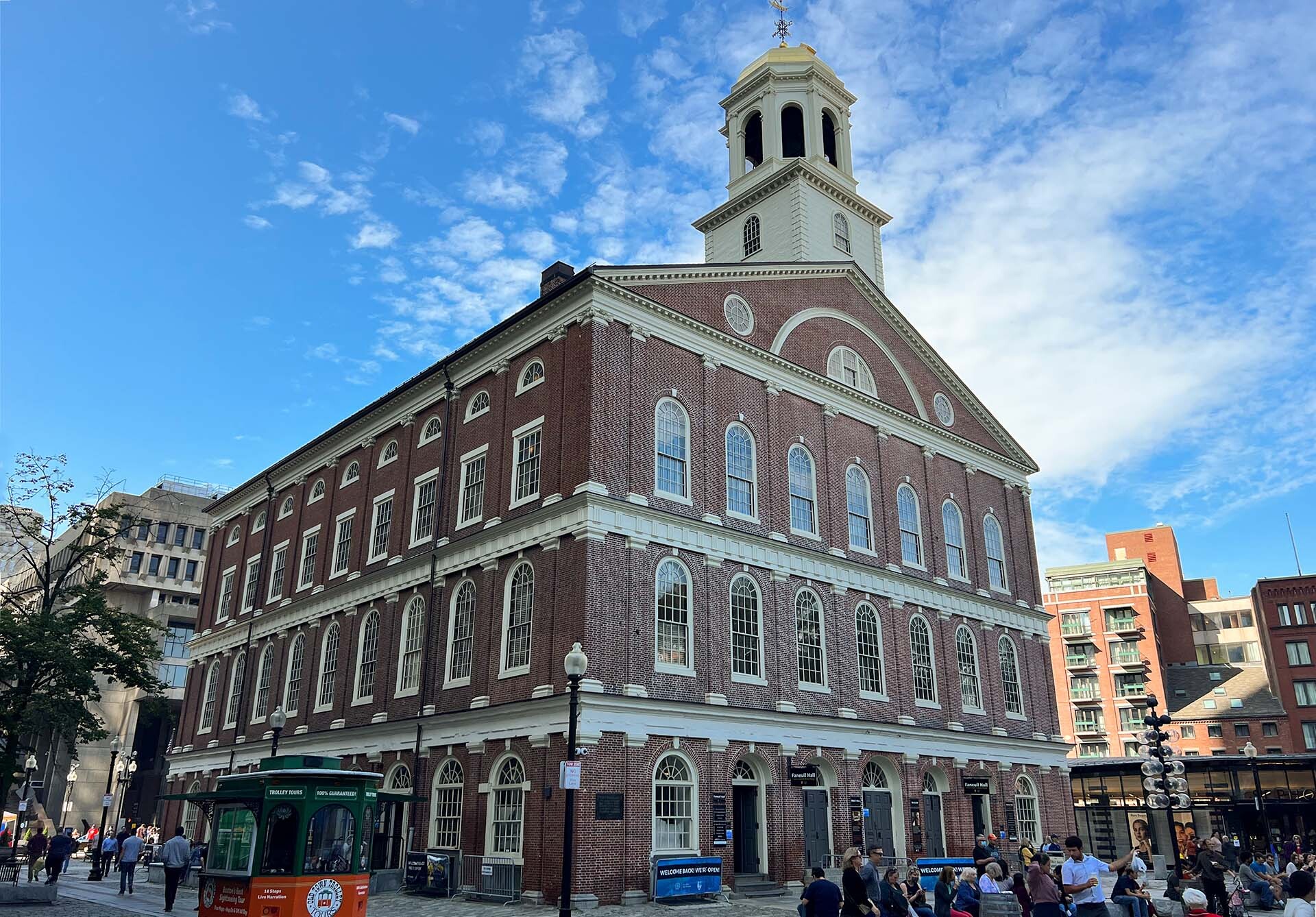
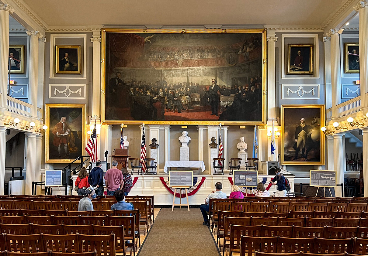
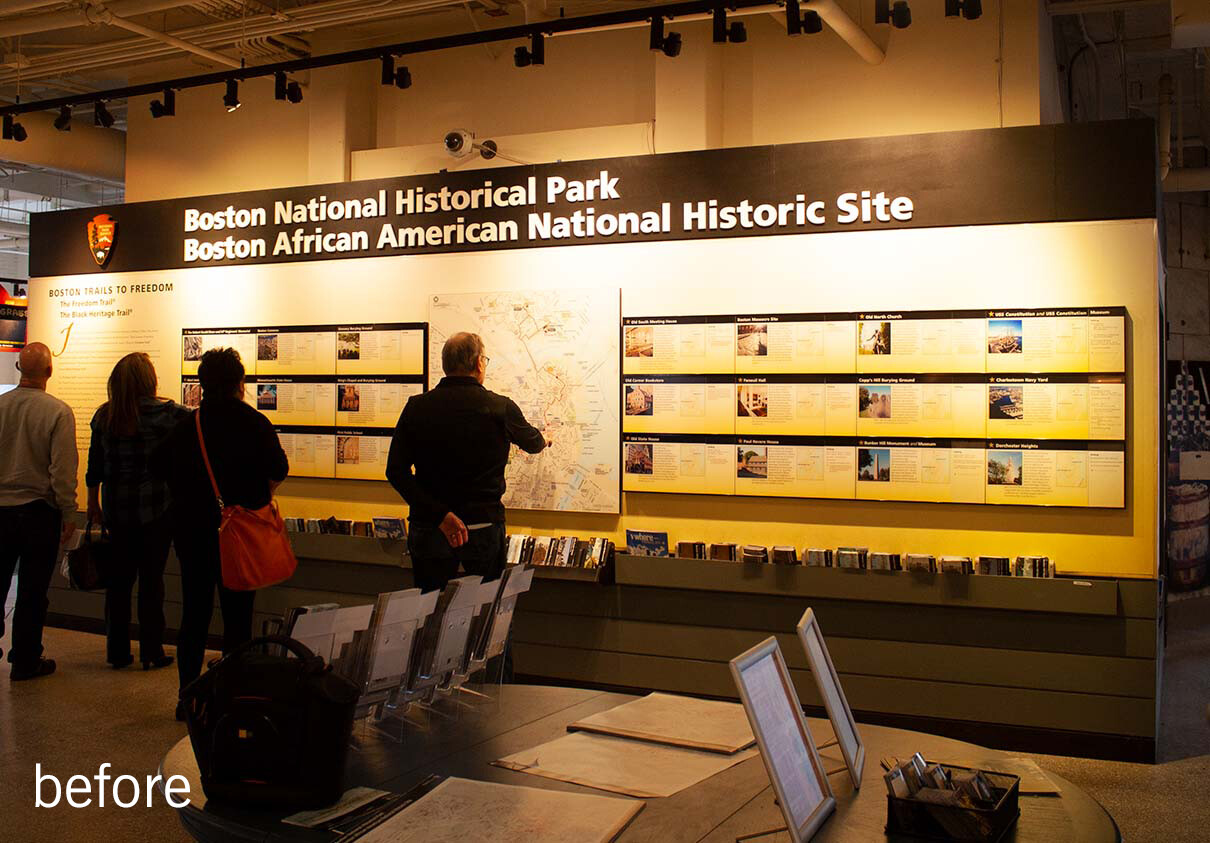
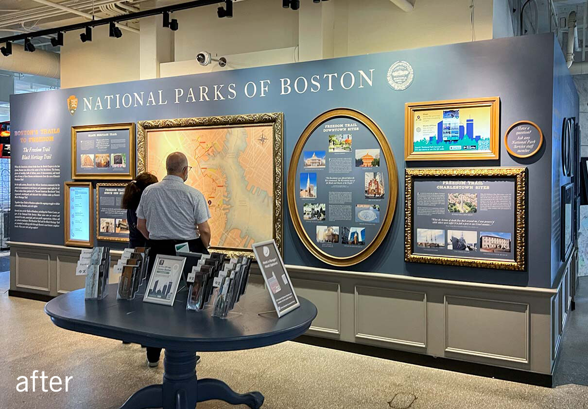
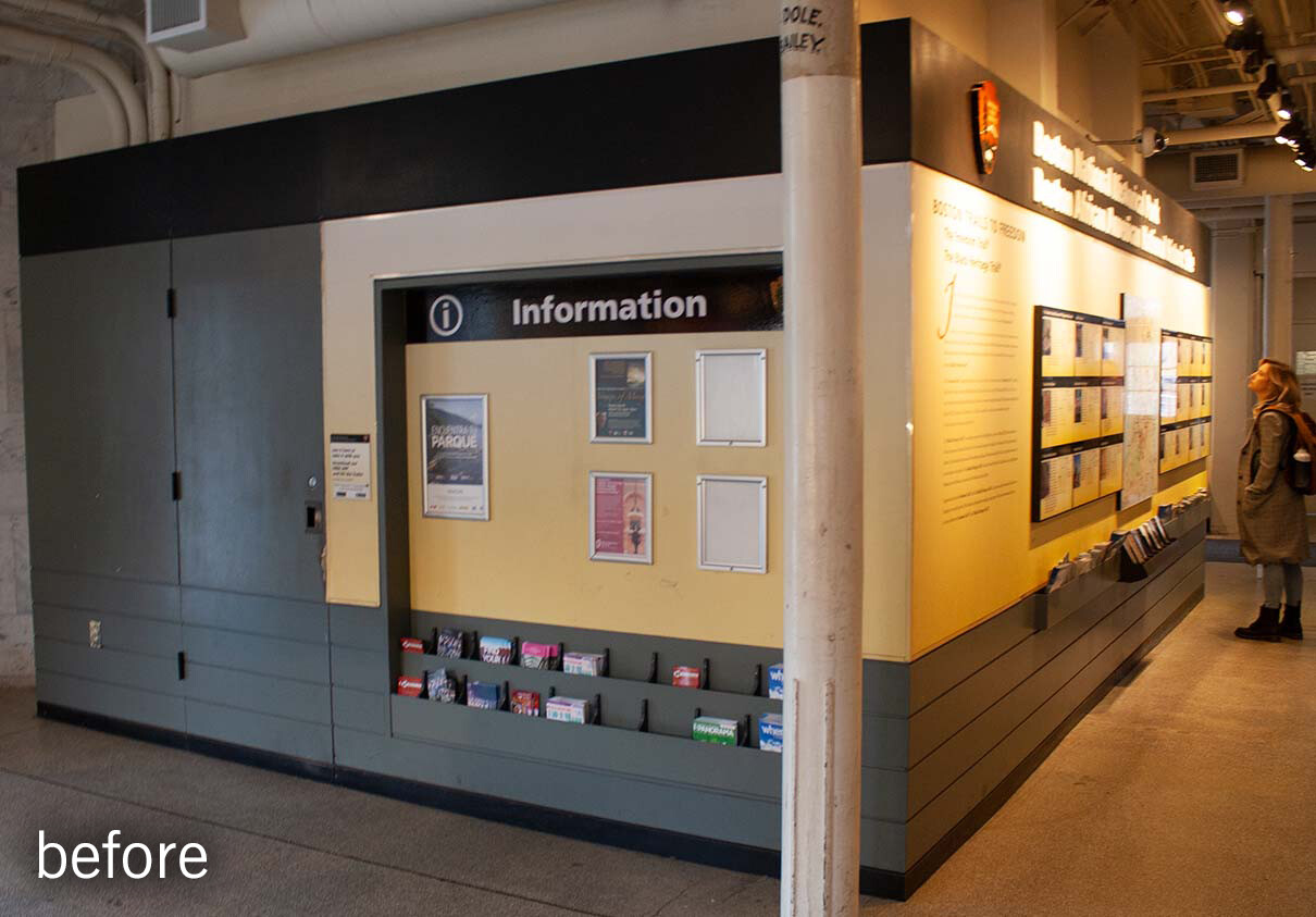
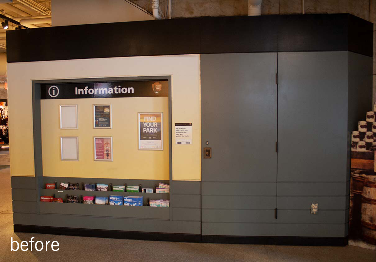
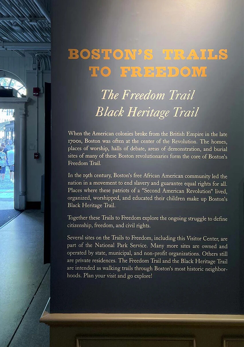
Located on the ground floor of the iconic Faneuil Hall, the National Park Service’s visitor center is often a first stop for exploring Boston. Whether they be travelers, school groups, or locals wanting to know more about the city, the NPS visitor center (with its friendly rangers) is intended to help people discover the historic sites along the Freedom Trail and Black Heritage Trail. But the center had a poorly lit, institutional feel with outdated displays, no way of showing timely information, and an out-of-scale, unwelcoming reception station. How could the space be redesigned to be more useful and also to reflect the historic character of the building?
mapping boston's heritage
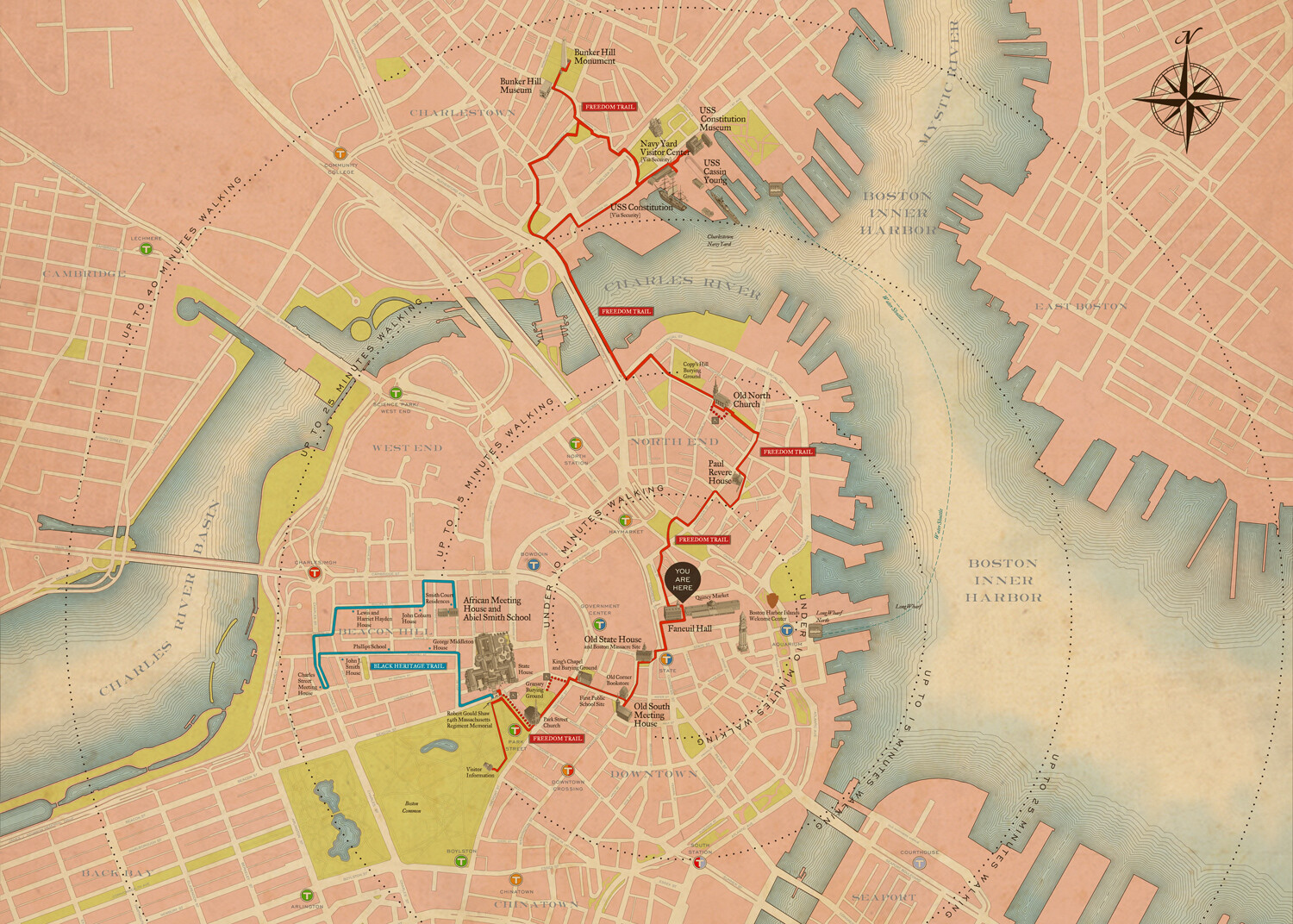
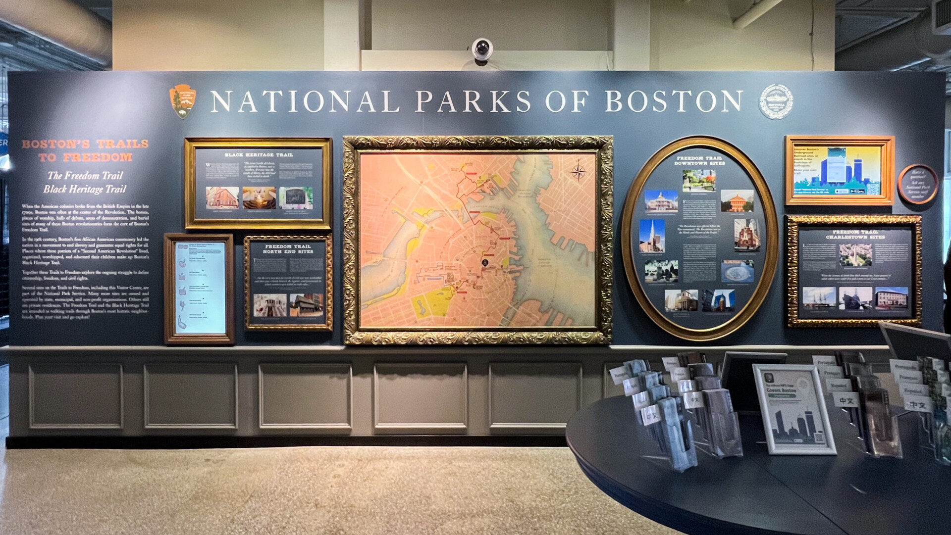
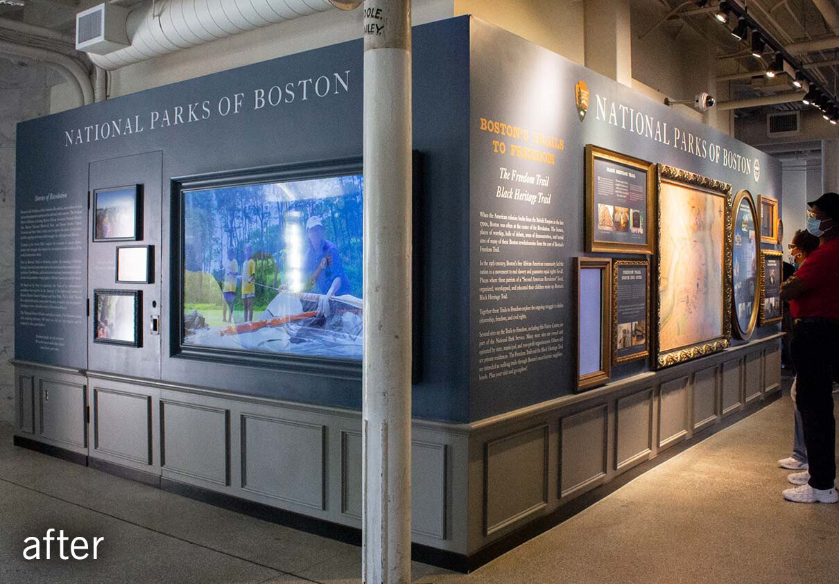
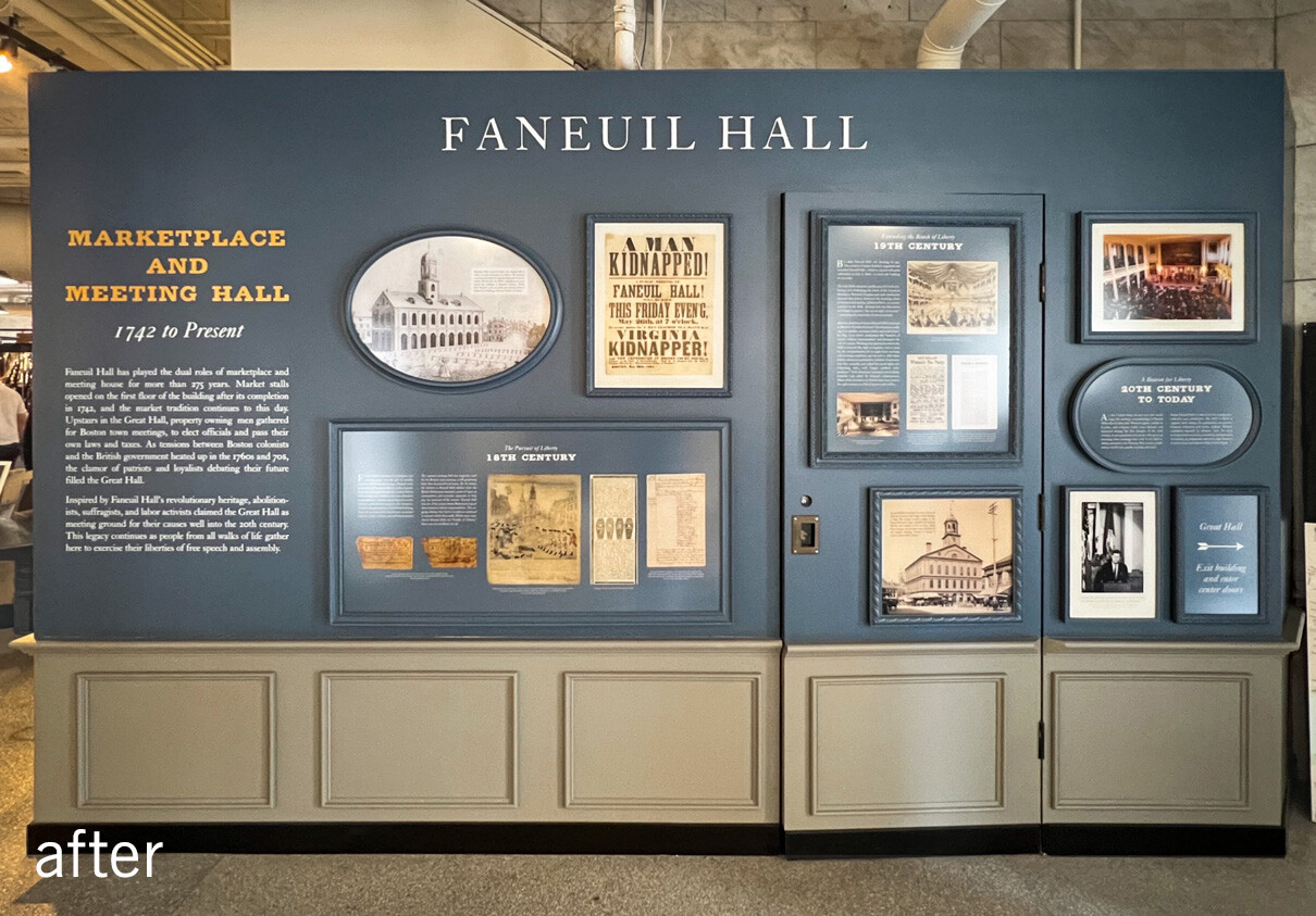
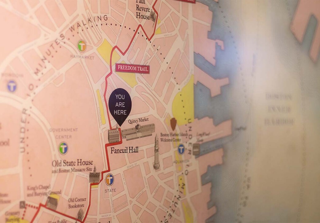
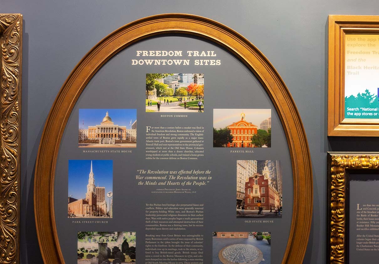
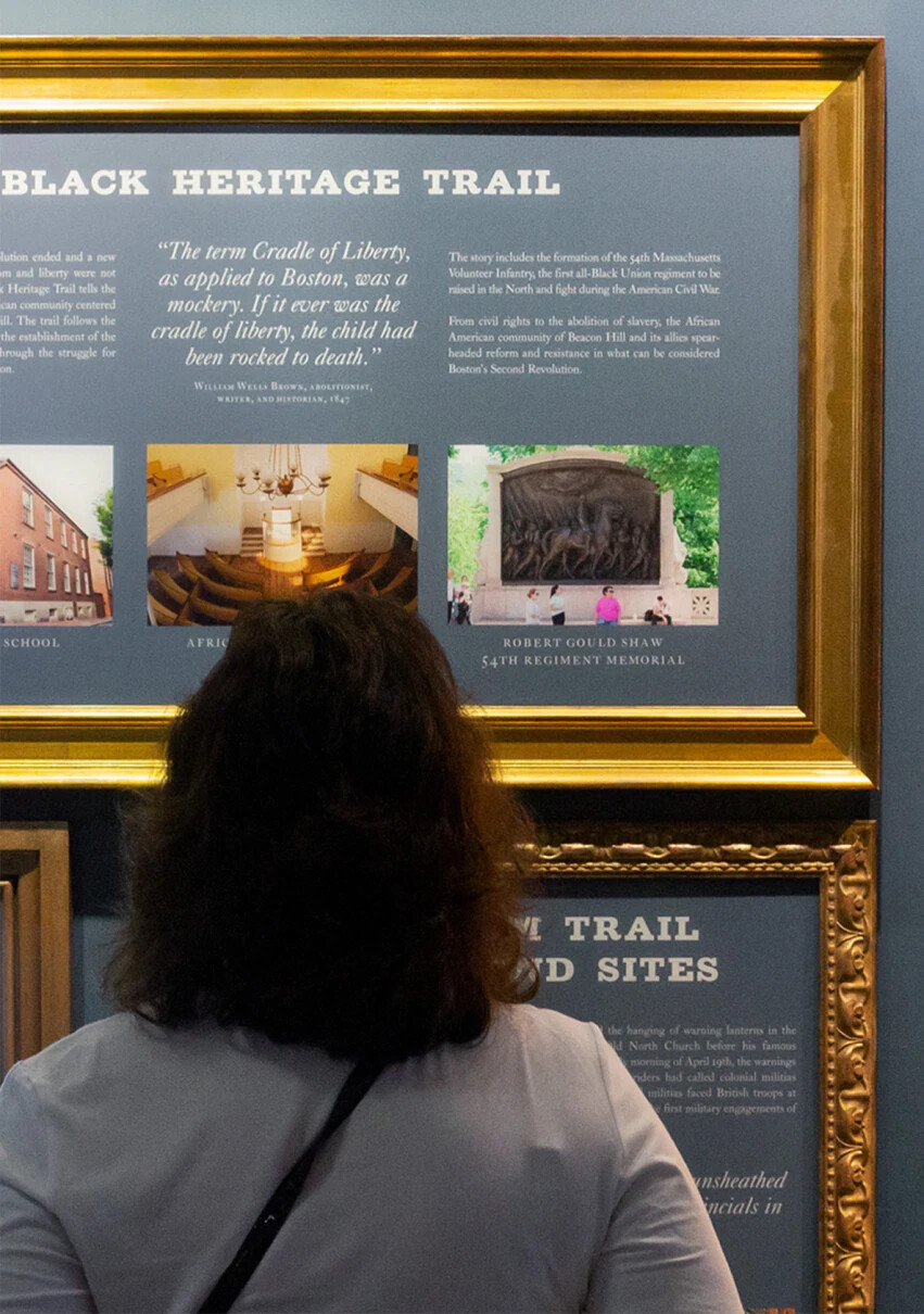
Following the design of a temporary visitor center, Visual Dialogue was primed to update the Faneuil Hall location by reinterpreting the main information displays and providing design recommendations for graphics, colors, and furnishings. The main wall features a large, hand-drawn map of the area, photos and descriptions of notable sites organized by location, and changing information about special events and hours of operation.
connecting past and present
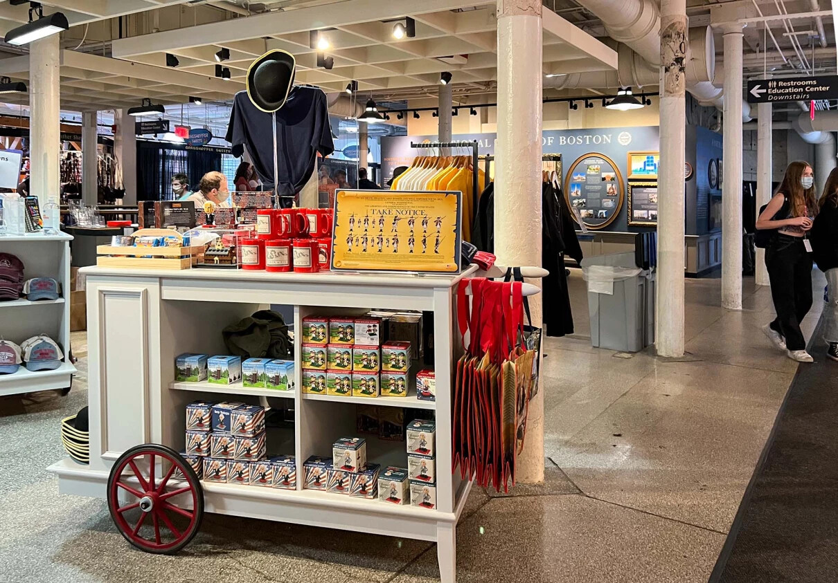
All this information is arranged in an array of gilded frames, creating a visual connection to the Great Hall on the second floor (the location of many historic events over the past 275 years). On the right side wall, information about the history of Faneuil Hall is displayed, while the opposite wall provides more details of other National Park of Boston sites in photo, text, and video form.
a speedy setup
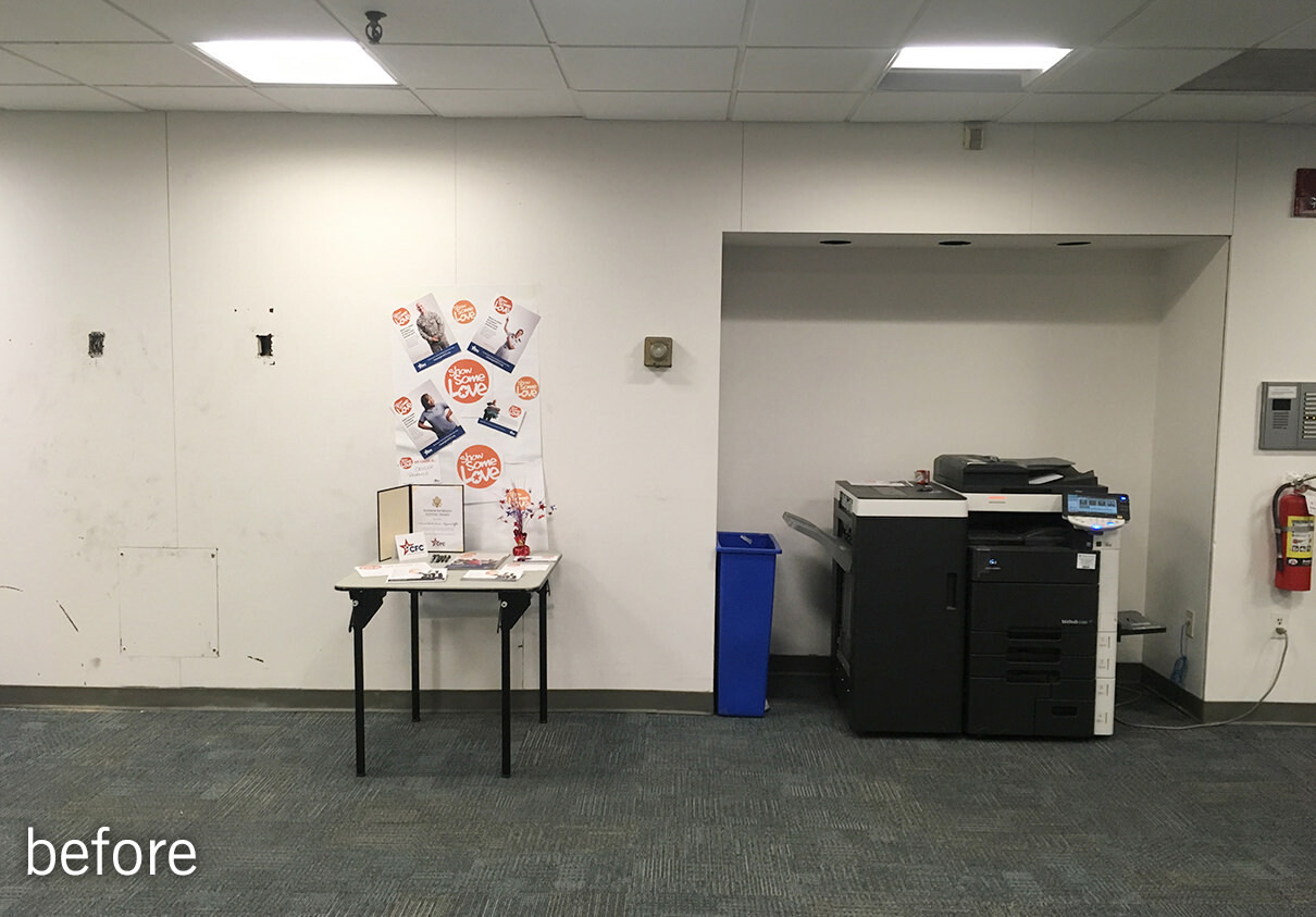
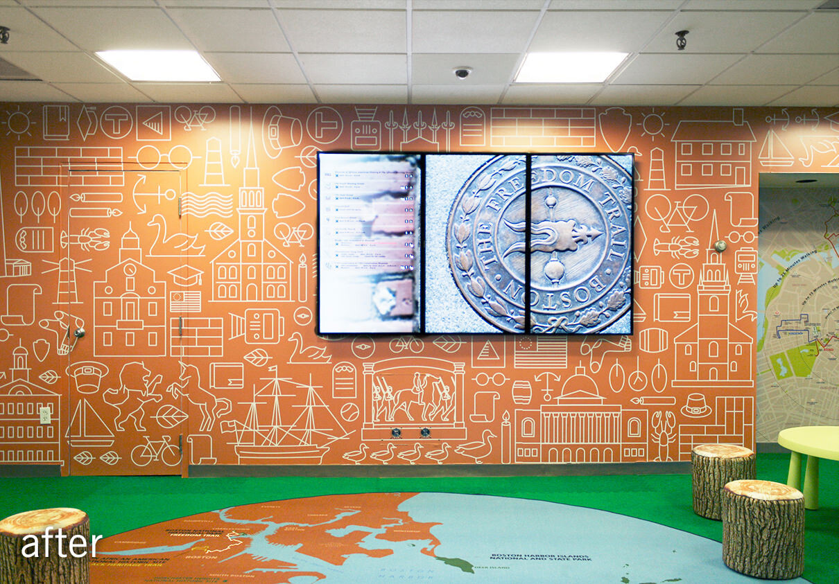
With Faneuil Hall closed for repairs, the National Park Service (NPS) had to move their visitor center and gift shop to a temporary location across from the Old State House. The temp space, in the bottom floor of an old office building, was occupied by a sea of cubicles on a drab gray carpet surrounded by beige walls. How could it be transformed into a warm, welcoming environment to greet Boston visitors and direct them to the historic sites around the city? And how could it be done in 4 weeks?
a friendly face
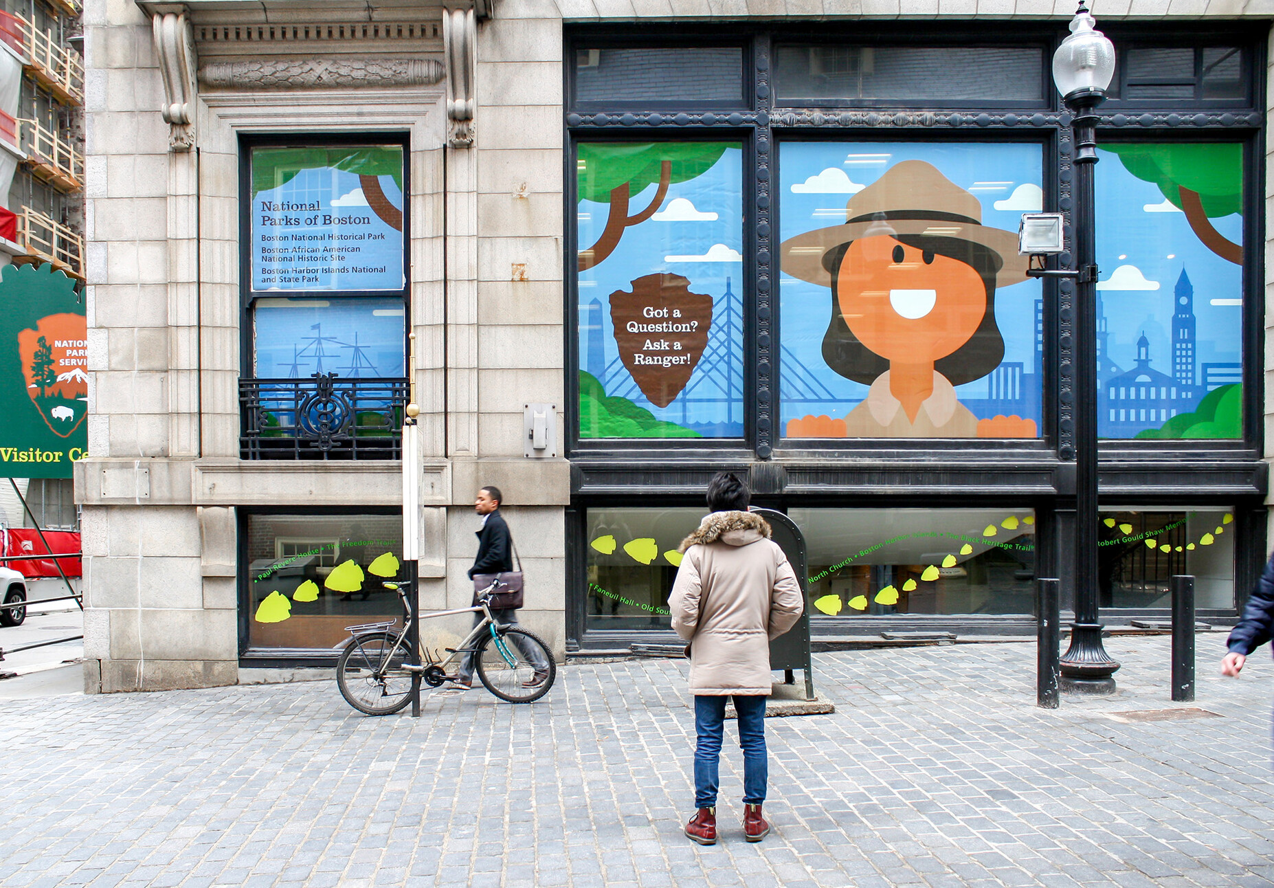
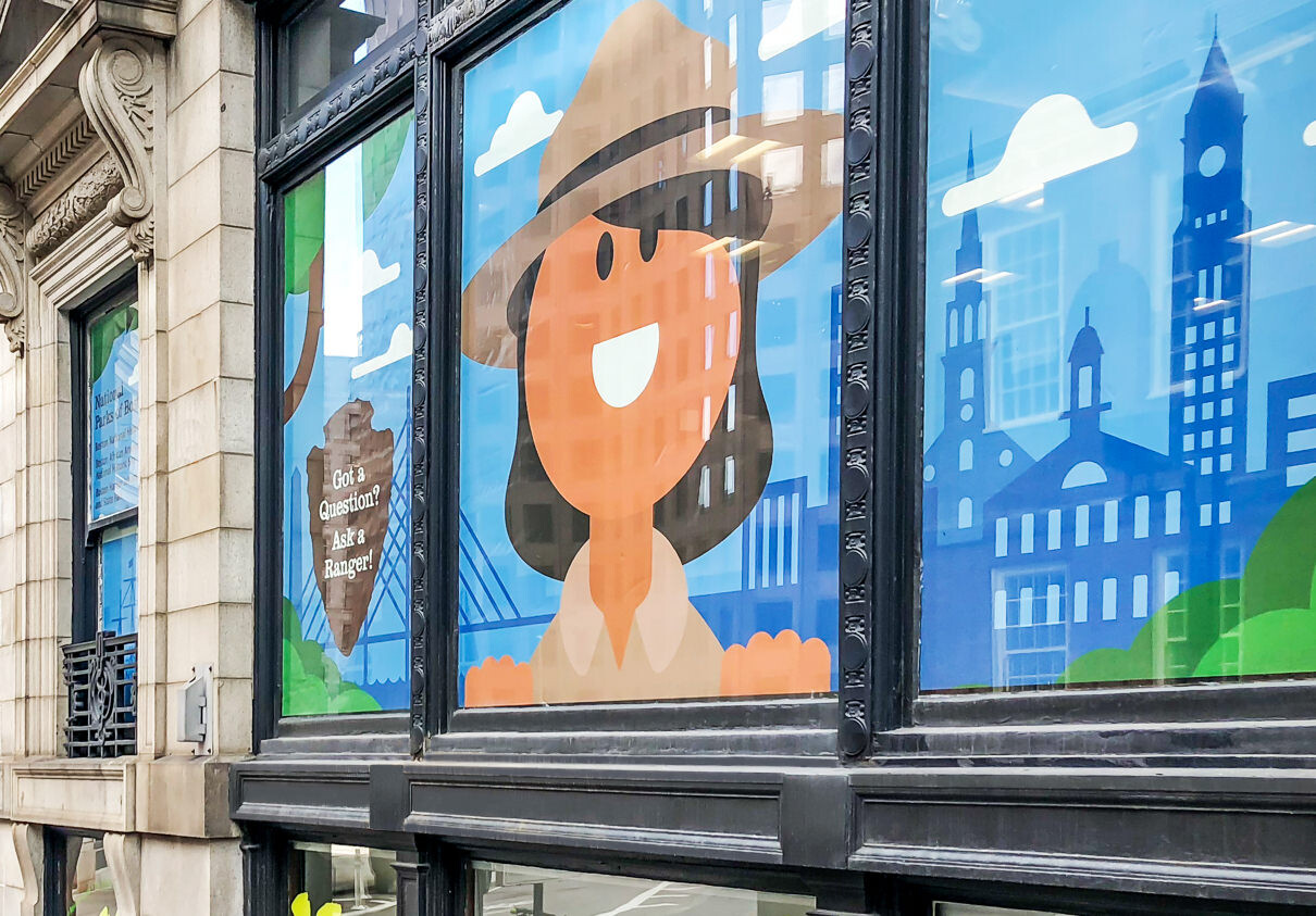
Visual Dialogue collaborated closely with NPS to bring the space to life through super graphics and interior design solutions. A 28' x 9' window graphic featuring an illustration of a friendly park ranger immediately got the attention of passers-by.
bringing the outdoors in
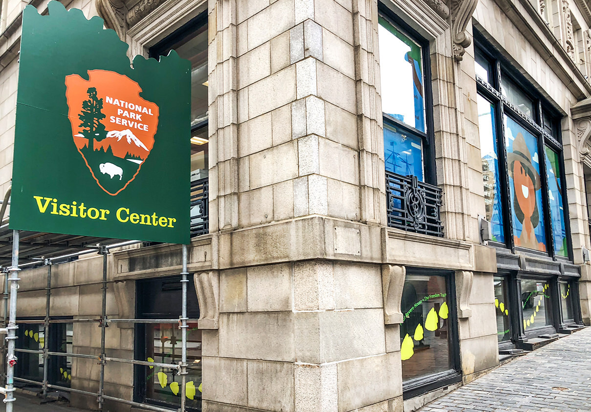
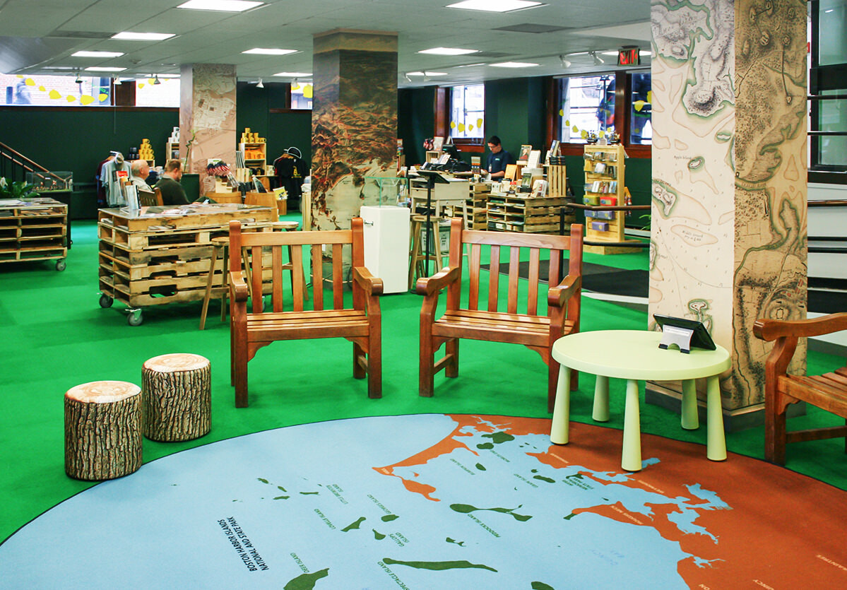
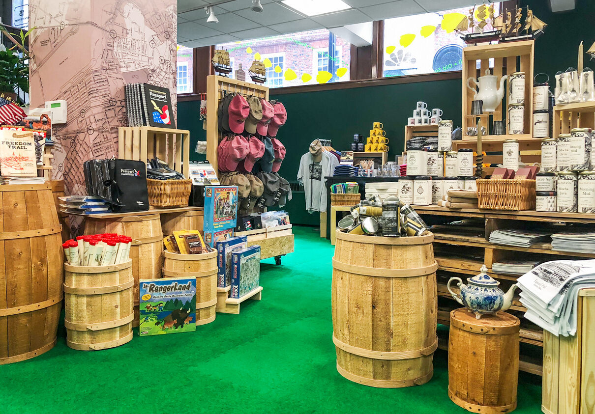
Arrows and a list of historic sites led visitors around the corner and under a hand-painted sign to the entrance. Inside, the space was transformed into an urban oasis with bright grass green flooring, plants, dark green walls, and raw wood furnishings.
from vision to reality
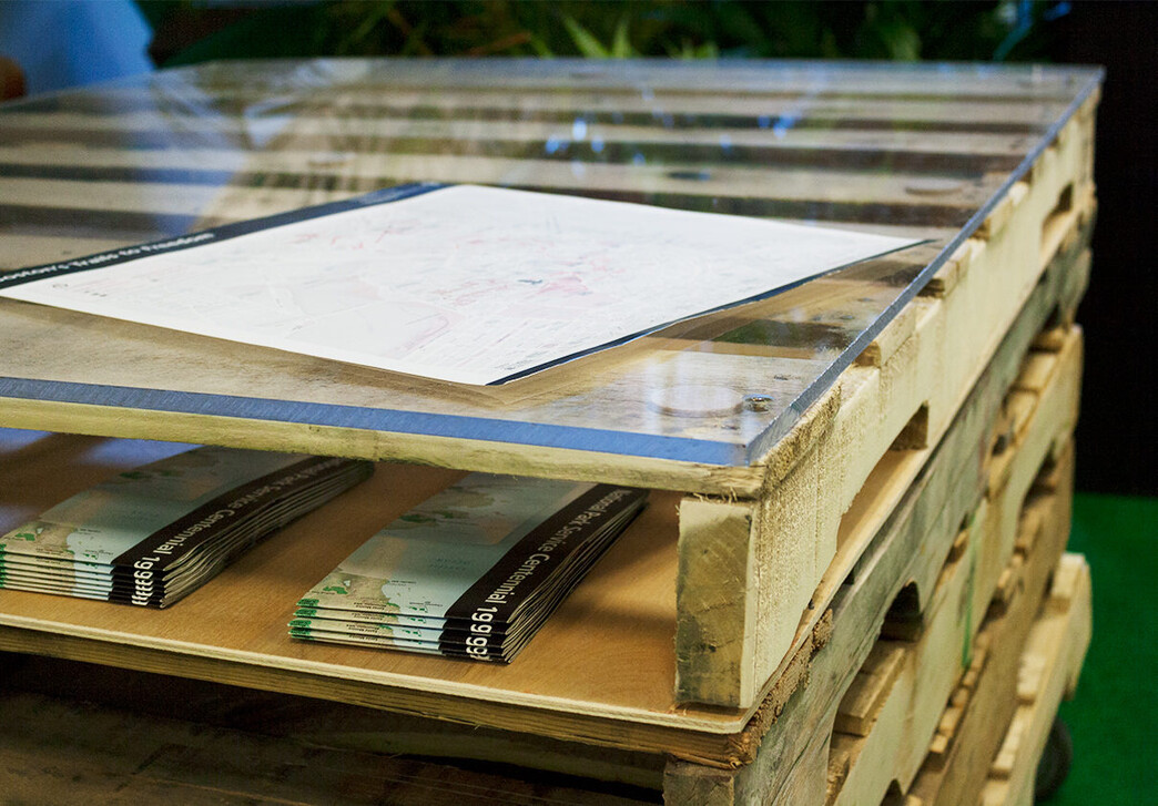
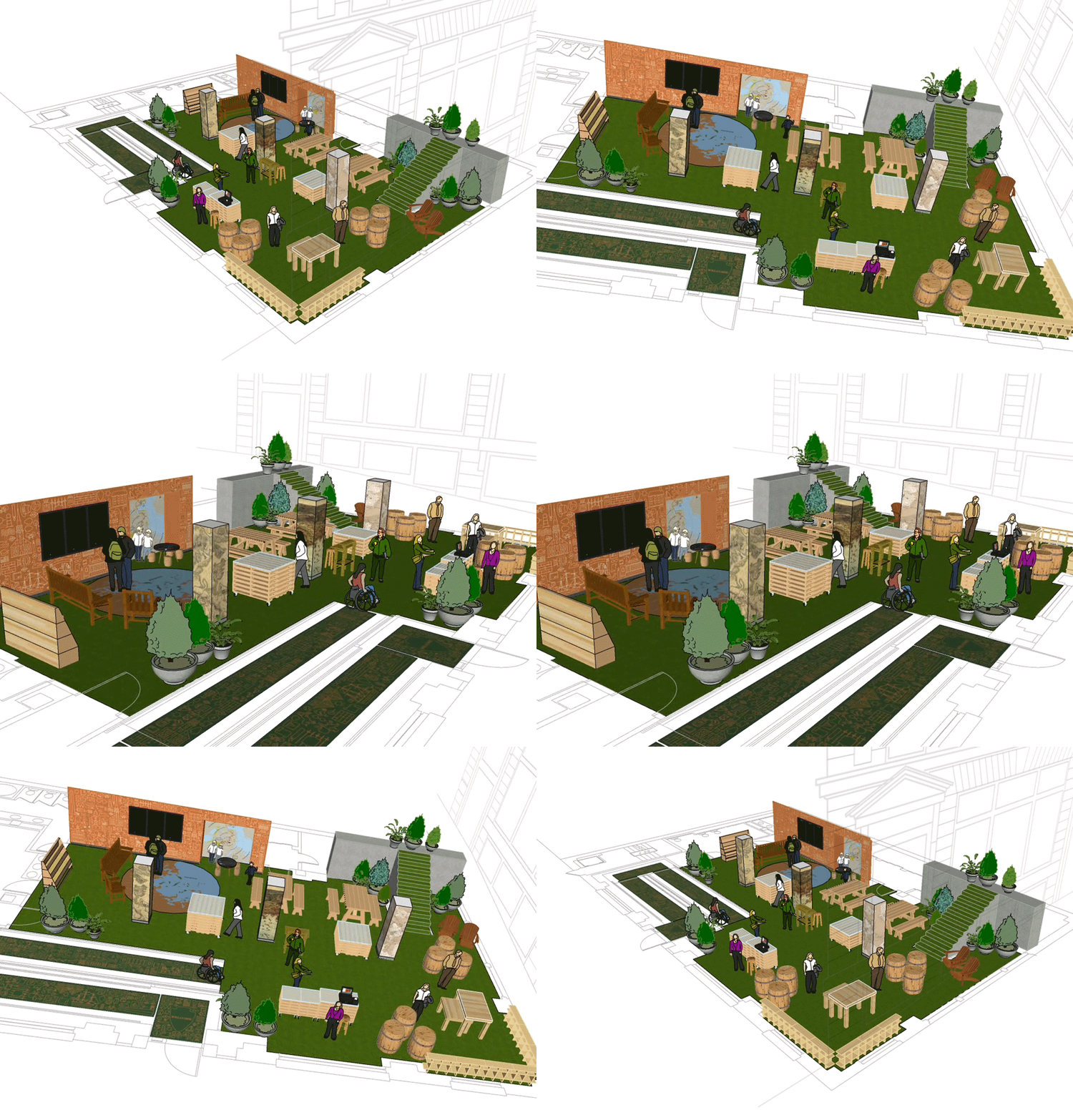
Large-scale maps were used to orient visitors while illustrations of iconic sites and historic images enliven the space. Utilizing 3D software, we built the digital rendering of the space before any physical installation began. The components were also designed to be repurposed when the visitor center moved back to its original Faneuil Hall location.
